Friday, 31 January 2014

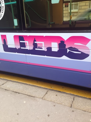
Type Journal- Leeds Buses


Block type 
Here is a bit of type I have noticed on the sides of leeds buses, it is very block and structured type what I did like about it is the silhouette of Leeds buildings within the type I think thats a nice touch however I'm not sure about the colour choice. 

Type Journal- Leeds Print Festival


Here is a little something I got given when I went to Leeds print festival last weekend. I like it because it is very decorative type and it is printed. I also like the gradient of colour and the handmade feel to it.  

Type Journal- Hardware Store


Old fashioned
This shop has gone for an old fashioned type, that has been sign written, it suits the theme of the store going for a vintage tool shop theme, its noticeable because it is different. 

Type Journal- Leeds Market


Old fashioned
The Leeds city market type is very old fashioned type, but it fits well with the market, I think it fits in with the architecture but stands out in white. I think it needed to be a serif font, it makes it more decretive. 

Type Journal- Sticky Feet


Cartoon 
I picked this leaflet up because of the bubble gum like type that really fits with the happy cartoon feel of the leaflet for a club night, it stands out well. 

Type Journal- Hand Drawn Sign


Hand drawn
I some times think that hand done signs catch my attention just as much as nice professional ones as I like looking at peoples handwriting as it says a lot about the person. I think some consideration has been put into this sign, the obviously wanted beer to stand out most by making it bigger, colour also has a big impact in the way that I read it, the vinyl doesn't stand out that much, I personally think that they should of just sticked to the 2 colours.  

Type Journal- Hairdressers


Old Fashioned Script
Here is a piece of type that I saw while walking through Leeds for a hairdresser, it has old fashioned characteristics and script serifs. It reminds me of alice in wonderland or Disney, personally I don't like it that much however I think it fits the hairdressers theme. 

Type Journal- Propaganda Attic


This is some type for a new club and I really like it, It reminds me of my favourite graphic designers Kate Morross. I like the boldness of it and how its quite geometric, the colours are bold and eye catching to grabs peoples attention. The only thing I don't like about it is the C as it reminds me of pac man. 

Wednesday, 29 January 2014

Colour Theory Task


Here I have chosen a mini cheddar packet and placed it on the 5 different coloured paper of green, yellow, red, orange and blue, I have noticed a few contrasts between them. On the blue there is a complementary contrast as blue and orange are opposite the colour wheel and the two colours are battling for your attention. 


With the green apple juice carton it blended in well with the green carton, and there was high contrast when it was placed on the red paper.  


With the red stamps I feel it stands out more on the green as they are clashing colours, and there is a very warm temperature when it is placed on the orange paper.


I think the yellow Selfridges bag worked best on the blue as yellow is quite a bright happy colour blue seem to calm it down a bit. The yellow of the bag is very luminous and even when placed on the yellow paper it was brighter. When the yellow was placed on the red it seemed to be working well together, the red and the orange made the yellow seem warmer. 


Here are the papers that I placed the objects on, I have tried to pantone match them with solid uncoated swatches. Below I got the colour swatches up on photoshop to see the difference between screen and actual person. 


359 U was the best match 


101 U was the best match


1797 U was the best match


1385 U was the best match


2985 U was the best match


With the Selfridges bag I pantone matched it using the solid uncoated swatch. I matched it to the colour 108 U, above I have put the image of the bag and the colour that I have matched it with, on screen they don't seem to match as well as they did in person.  


I have done the same with the red from the stamp book, it is a very bold and bright red, I think that I have matched it pretty well, the swatch above is taken from a coated swatch. C=0 M=100 Y=100 K=10. 


There are many different tones on the apple juice carton, I tried to focus on one tone and chose this one, I think it matches the cartoon well even when on screen. I got this from the coated swatches, C=70 M=0 Y=80 K=10


Also this mini cheddar packet has many colour variations of colour, I went for a medium tone to colour match and I think it is a good match on screen. I used the coated swatches, C=0 M=60 Y=100 K=0 


Monday, 27 January 2014

Study Task 2: Digital Typeface further experiments

Oblique, above is an image of oblique at 30% I feel this is too far, but it is interesting to see what the type looks like when it is manipulated too far. 

Here I have changed the weight of the line to create a light font, again I personally think this has gone too far for the font as you can barely see it and I don't think it would look good on publications. 


I have experimented taking the bold font further and adjusting the weight of the lines to make them heavier, I found that the heavier the line the lines began to join and merge into one big bold line instead of two separate. 

Task 2- Digitalised Typeface


Here is my font family in a digitalised format, regular, bold, light and oblique. 
I started with the font american typewriter, I found I didn't like this font as it has very ugly serifs, I firstly took the serifs off and didn't choose to replace them with anything as I don't think it needed anything. I took the ends off so it works with singular lines, I think it works well and is decretive. The hardest one to create on illustrator was the oblique one, but I figured out an easier way of doing it buy shearing it to 10%. 


Thursday, 23 January 2014

Brief 4: Final Outcome


Here is my final resolution for brief 4, I decided to change the name from 'passenger' to 'the highway myway' as I felt that it would be more suited to the audience. Also I amended the inside leaflet as I feel that before it was too messy and disorganised, I added the boxes to reflect the poster on the inside. I changed the information to information that you would see in the highway code, as it is more relevant. I tried to add illustrations of birds for the visual users. Inside is a poster that the user has to fill out, once they have filled it out it can be used to help them revise for their theory test. Overall I am happy with this final outcome and I think it has a good concept for the target audience, if I had more time on this brief I would of extended it and created an app to go with it. 

Wednesday, 22 January 2014

Brief 4: Development and problems


 While designing a poster and leaflet I have to take into account what paper/stock to print it on. Above is an image of my leaflet printed on cartridge paper but with some of the ink missing, I found the issue with printing on cartridge paper is that some of the ink creased or blurred when folding the paper also once folded the leaflet felt too thick. 


Here are two images to show the changes that I made before and after the crit. Before the crit I was unsure of what to put on the inside, but then after further research into the highway code I then remembered what I struggled with my theory and put them in. 


Throughout this brief I spent alot of time in illustrator creating the illustrations, I have learnt how well illustrator and inDesign work together. On indesign you initially think that your design will print blurry but it is just showing an on screen lower resolution. 


Saturday, 18 January 2014

Brief 3: Final Page Layouts


Here are my the print screens of the final designs of my 5 page layouts for brief 3. I have focused a lot on grid design and the designs of Josef Muller Brockmann. 


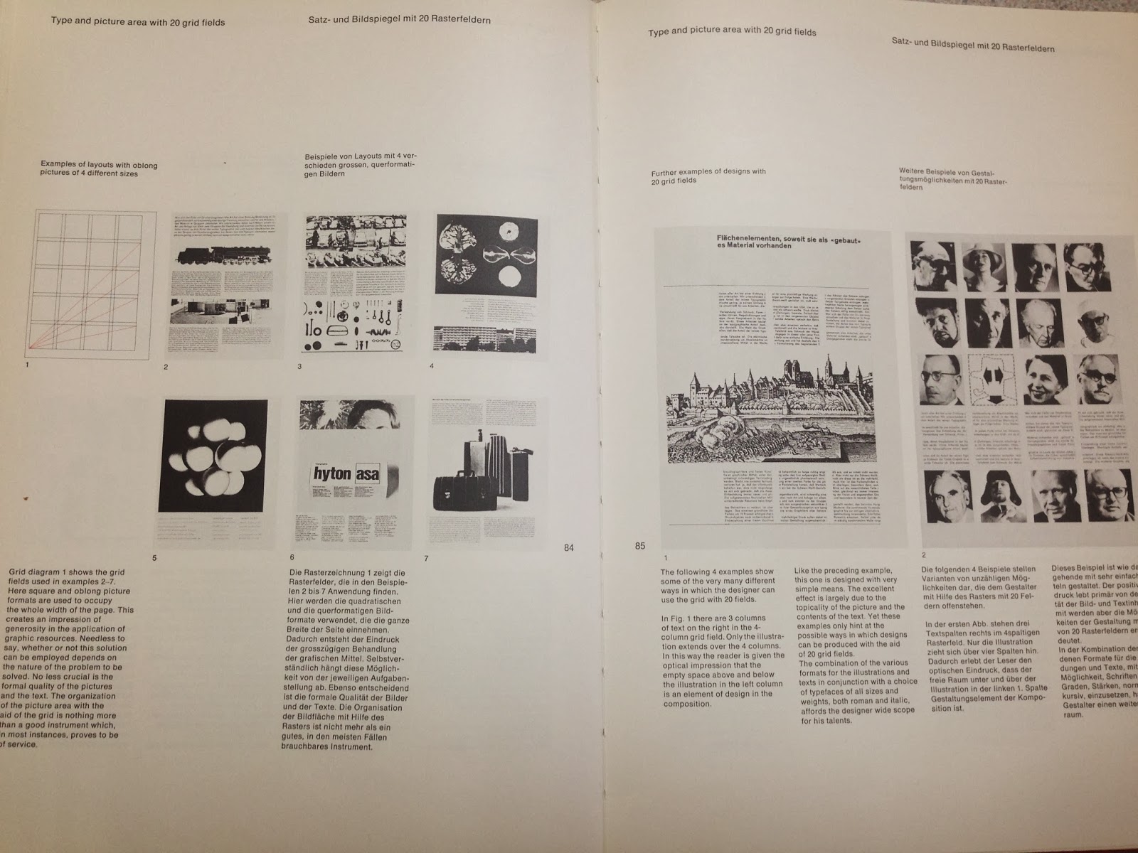
I found his book on grid design most useful for this brief and I think grid design was a relevant thing to look into as signs are structured and formal so I wanted my page designs to reflect this. 


I am happy with the way that my page layouts have turned out, they are quite formal and informative which is what I wanted to keep it factual. Looking into grid design was useful, I used the transport font in the end as that is what people recommended from the crit, as they felt the other font wasn't formal enough.