Showing posts with label OUGD504. Show all posts

Friday, 9 January 2015

OUGD504- End of Module Evaluation

This module I have learnt things for both print and web. I previously knew nothing about web so this module has been interesting, I have also learnt a lot about commercial printing, which has been beneficial. 

The first brief made me think outside of the box in terms of folding techniques. I experimented a lot with different folding techniques for this brief and how design could be printed onto it.  When I started to look at my design process initially I realised just how much there is too it. I tried designing my leaflet in a style that I had never folded before. The final fold I went for was actually a napkin fold, but I think it works well as it works as a desktop leaflet now. It took a long time to get the printing right on this leaflet as it kept printing the wrong way ect. I added the watercolour onto the paper because printing a pattern and lining the text up was proving very difficult. I am happy with the final product I think it represents my design process well, I am happy with the colours, if there was one thing I could change on the leaflet it would be for the ink not to crack when folded but sometimes that cant be helped.

With the second brief we got to choose a kick-starter project and design a logo for the project. I initially wanted to design a logo for a food company, I chose a lemonade company in Chicago. A guy that had just left uni and wants to sell cheap, fresh, homemade lemonade on a cart at Chicago beach. I made the brand considerations, and realised he would need a fun and fresh logo. I experimented with various ideas mostly hand drawn. In the end I decided to go for a hand drawn logo. I decided to go for yellow, grey and white colour scheme, the grey keeping it more modern. The logo worked well in context. I really enjoyed doing the hand rendered type for this brief, I made a lot of mistakes but I have definitely learnt from them. If I had more time I think I would of actually contacted the guy and asked him what he thought.

Brief three was the website brief. I am disappointed that I only learnt a tiny bit of coding as that was one thing I was looking forward to in second year, however from what I did learn from the first session proved just how difficult it can be. I have really enjoyed learning about the limitations of web, what you can and can’t do, the colour and font limitations. I have realised just how difficult designing for web can be and I defiantly appreciate it more now. I enjoyed designing scamps and looking more into grid systems, and the different formats of websites.

Brief four was an extension of Brief 3, designing something to advertise the website. Researching into augmented and interactive design has been useful. I defiantly think I will think about more interactive design in the future when designing. The workshops have been really useful; learning simple things like how to set up a document so it is ready to print perfectly has been really helpful. I will approach projects differently in the future now, thinking before I design it digitally to how I am going to print it and getting all the document settings right so I don’t panic at the last minute when printing. For this brief I 
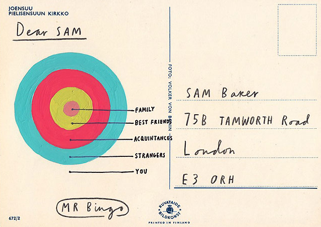
decided to design four things, a thaumotrope, zine, poster and postcard. I am most happy with the way the zine turned out, I think that the zine and the thaumotrope are the ones  I made the most mistakes on but also the ones I learnt the most from. I designed these with commercial print in mind, the one that would be the cheapest to print would be the thomotrope the most expensive would definitely be the zine. I thought a lot about the factors and considerations for commercial print.


Overall this module has been an eye opener to more of the digital and printed world. I have enjoyed the brief three and four most, If I had more time on this module I would of liked to have gone back and re visited my website and maybe of made some gifs of how I would like it to flow and looked into a more responsive mobile interface and how I would of liked that to have looked. 

Thursday, 8 January 2015

Studio Brief 4- Evaluation- Augmented Design

This has been an interesting brief and I have enjoyed finding out all augmented and interactive elements to design. I think with the designs that I have produced they would advertise my website and make people more aware of sign writing. 

I decided to put on an event as a way to advertise my website and run along side it. The event will be a sign writing festival, held in Hyde Park Leeds from the 26th-28th June. I have decided to have it in Hyde Park as larger pieces of sign writing could be on display on the side of verchiles ect. Within the festival there would be many live sign painters, live music and creative activities. 

To promote the festival and the website I came up with a variety of augmented and interactive ideas. 

Augmented ideas
-posters
-billboards
-side of bus
-bus shelter
-leaftlets
-newspaper/magazine advert
-mail/direct mail
-tickets for the festival

Interactive ideas
-thaumatrope
-something to submit to the festival
-interactive poster
-QR codes
-pop up book
-scratch off design

I decided to go for a thaumatrope, poster, zine and postcard for my designs. I think they all complement each other well along with my website. 

The first design I did was the Thaumatrope, this proved a lot more difficult than I thought. It took me various attempts to get the actual design right. I quickly realised that you cant fit much type on it for it to spin and make sense. I then tried to design it so when you span it the letters came together to spell out the website, this was very difficult to design and didn't work out well. In the end I managed to design it correctly. I printed it on a coloured stock and only used black ink because that would make it cheap to print commercailly. You can fit three thaumatropes on one sheet of A4 coloured paper which makes it good to commercially print. I really enjoyed making the thamoropes, they took a while to get right but I think the design is something different and interactive. 

The second design I did was the postcards, this was originally going to be some form of submission slip for people to come along and attend the festival knowing that their work will be displayed among other designers up and down the UK. I changed it into a postcard because I just thought it makes more sense as then I could send them out to designers and design studios but I could also use them as leaflets to promote the website and festival. I printed the finals on white card and they came out a lot better than I thought. If I was to improve these I would of spent more time on the design and maybe added some sort of pattern, I did try and add some pattern but it was just taking up so much time I just designed them with type. 

The next design I did was a zine. As the rest of the designs that I did so far were purely type based and I am advertising a sign writing festival I realised that I haven't used one image of sign writing, so I decided to make a photo zine. Within the zine I spilit it up into two sections, artists that are going to the festival and existing sign writing images that I took from my summer brief. I also want people to submit to the website sign writing that inspires them so I thought I would add some primary photos of my own. Also within the zine at the back are two QR codes, one for the user to upload images straight of their phone and one of a sign writing video on vimeo. by the time I put all this information into one zine it was pretty thick, so I had to start to think about binding it. What I initially wanted to do was to staple it, but I tried and there were too many sheets of paper for the stapler to go through. I thought of perfect bounding it but if I was to commercially print this perfect bounding would make it pretty expensive to print as a zine. In the end I decided to go for a metal fastener. This worked perfectly and I have never seen them until Danny showed me them, I am happy with how neatly it has put my zine together. 

The last thing I designed quite quickly was the wordsearch poster. This is my least favorite design out of them all, but I do think the design is interesting and unique and would get people to stop and read it. This would be cheap to print as it could just be printed on a normal laser printer for schools, colleges and universities to advertise to young creatives. If printed for a bus stop or train station it would cost a lot more purely because of size. 

Overall I have really enjoyed this brief, at the start I did find it difficult thinking of ideas but once I got into it it got better. If I had more time I think I would of done something with a different print tecnique that I haven't used before. I think they are all commercially printable and use very basic materials. If I was to improve on this brief I definatly would of spend more time on the interactive poster and spent more time on the thamotrope developing my design further maybe with moving vectors or type.  

Brief 4- Final Postcards Design


Here are my postcard designs printed on white card, they have turned out better than I thought. The only thing that I’m not too happy about is the ‘signwritersinspo.com’ bit as I think the type looks abit too small with a shadow, but other than that I think they work well as an extension of my website and would advertise the festival, website and social networking sites well. 

Brief 4- Final Signwriting zine


Here is my final zine, it has took quite a while to get right but I am happy with the way it has turned out. I printed the design out on A4 catridge paper for the extra thickness, I also like how its not a crisp white. It has printed out kind of grainy but I actully like this compared to high quality images. I prtinted the front cover out on tracing paper so it overlays the paint brush image that is also used on the front page of my website. I think it overlays well, I like how it makes the image less opaque but when you turn the page you get the full brightness of the image. Some of the pages I have printed the images out in balck and white and added them to a coloured paper to complement my website as some images change colour on my website with the interactivity. I have included quite a lot of my own primary images of sign writing to encourage people to submit their own work to the website. In the back of the zine I have added in a couple of QR codes, the top QR code would be a link to my website but as my website is currently not live it is a link to a vimeo video about sign writing. The bottom link its another link to a vimeo video, this would actually be in the zine. By adding the QR codes makes the zine more interactive as the user has to do something, it also represents the change between print and digital. Binding the zine was harder than I thought. At first I wanted to perfect bind it but then thought that if it was for comercial print and just a small zine it would cost alot more money to get each individual one perfect bound. I also liked the idea of stapling the zine as this would be a cheap and easy way to bind when printing commercially, when I tried to staple it unfortunately it didn't go through all of the pages, I asked Danny for some advise on what i should and he suggested that I used this metal clip that simply threads though the pages when hole punched. This has worked perfectly and im really happy with how neat it looks. Overall I am happy with the way my zine has turned out, the only thing I have an issue with is that sometimes the front cover because it is made out of tracing paper curls up at the front but other than that I am pleased with my design. 


Wednesday, 7 January 2015

Brief 4- Signwriting Zine

As the designs that I have done so far for this 'Augmented Design' brief have not involved any imagery of sign writing I want to create a small zine of sign writing in everyday places to inspire people. Within this zine it will include a QR code to the website or maybe the social media pages, I want to make this zine a digital and printed piece. The front cover is only going to be type inside is only going to be photographs. 

Zine Research

Henry Hoover Zine 


This is one of my friends small zines about henry hoover, its a very basic zine but thats what I like about it, it has a handmade feel to it. The only colour within it is the red paper used for the front cover, the rest of the zine is in black and white. 


I really like the hologrpahic paper on the front cover of this zine, I think this would look good with some simple type added to it. 


The colours of this zine makes it attractive and eye catching this would make me want to flick through the inside.

The pastel colours complement each other well, they stand out against the greyscale


I will need to think of how I would like the photo's to be laid out inside the zine, there are many formats I could choose from.


I will also have to consider what sort of binding to use, saddle stitch would be a good option but I do need to think about commercial print which I think a simple staple would be better. I don't think the way this is made needs to be too over the top as this small zine would be made in mass and it is only something to inspire people and hopefully get them to check out the website or social media pages. 


Development


I worked out how big I want my zine to be on paper first so I could visualise it better, because most of the images on my website are a square I am going to have every image in my zine a square to fit in.  


The front page of my zine will be the same as the front page as my website as then people can relate the two. 


Above is the front page of the zine, this will be printed on tracing paper and the image shown below will be behind it, this is the same image off the from of my website. 


I have now laid out the 27 page zine on separate pages. the images are 10x10 with a border around them. The black and white images will be printed on coloured paper, the same colours used within my website. Inside the zine there are various artists/sign painters that are inspirational, I have included their website and if they haven't got a website I have put an e-mail address for you to get in touch with them. Some of the artists within this zine will be at the sign writers festival doing live exhibitions. Also within the zine are images from my summer project and more primary images from just being out and about of sign writing like I like and admire, underneath these images are where the photos where taken. Also in the back of the zine there will be a link/QR code for people to submit their own work. 


Above is a quick one page test print I did on my printer, I am really glad I did this test print as now I have realised that the images and the whole thing is far too big. I am planning on printing each image on a separate page because I want one image per page so people take more time to look at each image separately. I am going to resize the document so more than one page can fit onto one A4 page because if I was commercially printing this I would be wasting a lot of paper.  


Tuesday, 6 January 2015

Brief 4- Interactive Poster

For this brief I also wanted to make an interactive poster, as sign writing is an old form of typography I thought it would be a good idea to make an interactive poster by having a word search poster, I only want the poster to be very simple advertise the festival but enough information on the poster to make the people want to know more and visit the website. 


Word search poster Research


This is a word search print I found on Behance, I like how there is no letters where there is no word I think it makes it easier to read, but in terms or interactivity it makes it pretty easy to do. 


Here is another example of a word search poster, again very simple but effective. 


Another word search poster, I don't like this one that much but I do like the colours. 


Development


I started to design the word search with a pattern down the side as experimented previously on the postcards. Once I had put the pattern down the side I then realised that there is no point to it and I don't like it that much on the poster. 


Above I created a much more simpler design and I much prefer it, as much as I just like the red,black and white I think I should try and incorporate more colours off my website. 


Above is my final design, the design would be put around in local shops, universities, colleges and schools to get creative people interested in the event. I haven't put too much information on the poster as I want people to check out the website and find out more for themselves. 


The design could also work on a larger scale. 

Saturday, 3 January 2015

Brief 4- Submission Slip/ Postcard

As part of the festival I would like people to submit a small amount of hand drawn type/ doodle to the festival to be displayed on a large wall. This would be a talking point for people to network. 


Above are a few sketches of the front and back of the submission slip, in terms of quantity there would have to be hundreds of these printed.


I took inspiration from one of Tyler Spanglers patterns and created the pattern in the colours of my website. 


I started to experiment with shapes and colour on illustrator


I made the design (above) but then realised that there is so many colours in the design and if I wanted to print hundreds to be handed around Leeds it would cost a lot to print as there is so much colour. 


Above is a screenshot od how the design would look all together on the wall,  I think it works well as it is a repeating pattern, the only thing that would concern me is the cost of printing it all. 


To reduce costs I have thought about printing my design onto coloured paper, to keep the colour theme going that runs alongside my website. 


I got some colour card in the colours of my website, I think this will work better and reduce the costs of printing considerably. 


When printing a couple of tests I realised that I should change the size to A5, because even if I had the size as B5 it would still use one sheet of A4 per entry slip, but with A5 I could fit two per page. A smaller design is going to be much better. At this point I am getting really stuck and not liking what I am designing.


Postcards

I have had a brainwave instead of doing a 'submission slip' for people to display their own bit of hand drawn type for the festival, I think a post card would be better, I think it will work better in terms of design and it could be sent out to various designers/ design studios for them to submit a piece. The postcards could also be handed out around leeds and posted to other creative places and universities. I am going to start my design again.

Research into postcards


Mr Bingo- Hate mail

The Project
I love post and I'm worried that people don't get enough 'fun' post these days.
Especially postcards.
So I had an idea. It's very simple.
You send me fifty quid (plus postage) and I'll send you a vintage postcard with a 
drawing and an offensive message on it. (that's why it's called 'Hate mail').
So you get an original signed drawing, the postman get's a laugh and the world
get's a little bit happier.


The rules
1. Each piece of postcard 'art' will be completely random.
You are not allowed any specific requests, you just 'get what you're given'.
2. If you're sending Hate Mail to someone else, please remember to change the name and address in Paypal so it goes to the right place.
3. This is only open to people from the UK (for now) I'm afraid, sorry lovely overseas people! You can of course purchase one from overseas, as long as it's being SENT to a UK address. I will also do another international round in the future, I promise.
4. Mr Bingo is not responsible or liable for anyone who suffers any mental damage or suicidal feelings as a result of receiving Hate Mail.


I really like the project Mr. Bingo did for hate mail sending people mail that they wouldn't normally receive, most of the postcards are offensive but thats what people like about them. They are attention grabbing keep sakes that people display as pieces of art. 


Letter pressed postcards by Kerr Vernon 

When GF Smith came in to visit us what really caught my eye were these postcards. The paper and the way they were printed really gave them a quality feel.

Packaged in a wax-sealed bellyband and housed in a  card folder, the five letterpresses postcards within the package feature lyrics from songs by some of Vernon's favourite Glasgow-based bands.
"Everything was printed on duplex GF Smith colorplan, except the Frightened Rabbit postcard which was printed on triplex," explains Vernon of the thick, colourful and layered stock the postcards are printed on.


Above are some quick sketches of ideas for the postcards, I have to fit quite a lot of information on the one side as I want the other side to be where the user designs some type. 


Above is the first design I have done, I have realised just how much information I have to fit on this postcard. I think I am going to keep the other side completely blank. The website needs to be one of the boldest pieces of information and kept in the same font as the heading. 


The above two designs I have experimented with changing the colours of each word, the colours to match my website.


Again I have experimented with using shape and pattern in my work, I like the design above, it sticks to all of the do's and dont's in the project rational. 


Above I was experimenting with how the design would look if I printed it off on coloured paper like the thamotropes, I think it would look good and reduce commercial printing costs however when the postcards would be displayed at the festival I think it would be better to be printed on white so people could add there own colour to there design. 

I have decided to go for the colourful type design idea, this way I can make a collection of postcards with all different sayings to promote the festival and website

-do you love type?
-1st sign writing festival 
-stay inspired 
-create and get your work displayed 

Postcard Grid


I have set up a grid for the postcards as it is going to be all type and I want to keep it organised. The green is where the address will go, the yellow is white space and the blue is where the design and information will be. 


I printed out a test print and realised that the design is way to small at 5x3 inch, I need to make my design bigger but to fit at least 2 postcards per A4 page. With this design being so small the type feels quite cramped, so I have now decided to have the postcards 6x4. 


I incorpriated the colour within each letter to make it bold and colourful 


I then added a shadow onto the letters, I think this looks a lot better as the colour is still there but it is more readable. 


Because there is a lot of letters on the '1st sign writing festival' I have tried out making each letter a different colour and each word because I am unsure whether each letter is too much and difficult to read. I will take both ideas to the crit and get some feedback.