Showing posts with label YCN. Show all posts

Saturday, 21 March 2015

Responsive Collaborative- Taylors Coffee- Evaluation

OUGD503- Collaborative Practice- Taylors Coffee Evaluation

We chose this brief as a group as we all have a key interest in product design and packaging and it is something that we all want to develop more. I chose to work with illustration, as this is an area I am partially interested in. I have also chose to work with people I didn’t previously know as this is how it is going to be in industry.

The first thing we did as a group is write up a contract confirming what our strengths are and what we can bring to the team. What I felt I could bring to the team was my knowledge of type and layout, one of my biggest strengths is also organization. After speaking to Janin and Rona they told me how they would like more structure and organization in their work, I thought I can defiantly help them out with this. I was chosen to be project manager meaning I am in charge of organizing when things need to be done by, and organizing who is doing what.

The next step was to research; we researched into many areas including Taylor’s coffee as a brand, coffee its self and where it comes from and how coffee is processed, this was useful in giving us some background knowledge. One mistake we did make when we started this project is that we didn’t realize that we had to make a ground coffee product and we were thinking of ideas for instant coffee instead, after a couple of re-reads of the brief as a team we eventually started to generate some ideas.

To gather some primary research we set up a survey on survey monkey and asked our target audience many questions about coffee, how much they pay, what brand they normally go for, do they know how to use a cafetre etc. We got some useful feedback back and this helped us a lot with our concept for the new Taylors product.

Our concept based on our primary research is to have a new decorative illustrative jar that young consumers would want displayed in their student house. Along side the glass jar we would also design three packets for morning, daytime and evening depending on when you drink coffee most focusing on occasion. The morning coffee would give you that morning boost to wake you up, the daytime one is to keep you going through out the day and the night time one is a decafe to chill you out after a long day.

To get some ideas going in terms of design of the product we all went away and chose either morning, daytime or evening and made some collages of things that remind us of that particular time of day. This helped a lot before putting the final design together because we all got a say in what we would like in the design, and why we think it would be suitable.

My main parts for this brief was the type and layout, so I started to look into the type and layout on Taylor’s products. I researched into previous layouts and type within Taylors coffee and found that the type and layout they have now is defiantly their strongest. One element we also wanted to bring to the product is interactivity with the use of QR codes. This would be a good way of the younger customer scanning the QR code and for it to load a video of how to make the perfect coffee.

One main concern I did have with this brief was how I was going to mock up the design on foil packets and to still make it look good and realistic. Before the final design got sent over I practiced with an image off the Internet to make sure I could get the technique right. The final design then got sent over set up on a 7x40 cm canvas document, which is the perfect size for the sticker on the jar, however when I mocked it up I need the design to be bigger as every time I resized it for the packet it went blurry. The moc ups being blurry was defiantly the biggest issue we had with this brief, but unfortunately there wasn’t much we could do.


Finally we printed the label and booked out a photography studio to photograph the final product. The most difficult thing about photographing the glass jar was getting the lighting right on the glass. Overall this has been a really enjoyable project to work on and I am really happy with the final outcome, as a team we have all worked well together and combined our ideas to come up with this new Taylors Coffee product.

YCN Interflora Grandparents Day- Evaluation

OUGD503 Responsive YCN Interflora Evaluation

I chose this brief after reading it in much detail. The aim of the brief is to boost awareness of grandparent’s day to a younger audience, when read in further detail it goes on about when younger students don’t see there grandparents as much as they would like due to other commitments. I have previously never heard about the brand Interflora because I have never ordered flowers, but I do think they have a valid reason for their campaign. They want young people to sent their grandparents flowers to let them know that y are thinking of them on grandparent’s day.

The first thing I did was research into Interflora as a brand and their competition. The first obvious thing I did was visit their website. The immediate reactions of the website was dull and boring, it didn’t excite me or make me want to purchase any flowers. The website is defiantly aimed at middle-aged women. I noticed that many of the links were on the website multiple times and that there is a white banner down the side of the website because the sizing isn’t correct. Looking at the competition I noticed that their websites are much more clear crisp and less over crowded.

To get some ideas flowing I then did some primary research into grandparent’s cards to see what tone of voice they usually go for. I visited Marks and Spencer’s and paper chase for this, and realized that most of the cards go for a humors tone of voice for grandparents. Following on from this I then decided to make some lists of what grandparents like and sketched out a few ideas.

My two main ideas for this campaign is the a seaside/ day out campaign as this is one of the main things I used to enjoy with my grandparents and the other one being some chattering teeth to add a humorous tone to the campaign.

I went for the chattering teeth idea and managed to find a pair of chattering teeth, I photographed them, printed and illustrated the teeth. This came out a lot better than I originally expected. The hardest part of the illustration was getting the eyes right, getting them to look in the right direction and not to be scary. I wanted to add some colour to the campaign as I am not a massive fan of the company’s colours being black and gold, I understand that they want a high quality/ high end look however I don’t feel this colour palate would fit in well for the younger customer.

Once I designed the chattering teeth that was the main icon for the campaign, I used it across a variety of outcomes from print to web and mocked them all up to show the range it could work across. I am happy with the way that the teeth have turned out and I think it works well on all platforms; my partially favorite outcome it works on is the flower paper.


I booked a photography studio to take my final photos of the product range for YCN and for the photos to look more professional on my design boards to send to them. The biggest problem I had at the shoot was actually wrapping the flowers and the lighting, the images didn’t  turn out as well as I would of liked, but in the future now I realize that I might need to ask a friend to help me while shooting products. One thing I do want to work on is my tone of voice when writing on design boards, I sometimes find that the most difficult part of the project, this will be something I need to develop and improve in the future.

Friday, 13 March 2015

YCN Interflora Grandparents Day- Moc up's


Above are images of interfloras brand guidelines, these are items they already use with their house style applied to them, for the grandparents campaign to grow I think they may need to change these. 

Here is the teeth in the gold provided by interflora 


At first I just experimented with putting one teeth in the middle but it looked a bit lost


I then made a pattern out of the teeth using the brands colours to link it all together 


To make the campaign bigger they are going to need to advertise grandparents day, I want the consumer to realise how much their grandparents have done for them and say thank-you.
I created this poster/ advert to spread across all platforms of advertising. It's a fairly simple design but it uses the brand colours, is humorous and I think it fits in with the brand nicely. 


Here are a couple of moc ups I have done with the advert on a bus stop and in a newspaper, to hit the younger audience Interflora I think might have to consider advertising on social medias such as facebook and twitter. 


I really don't like the website they have at the moment for interflora as there is far too much information on it and it needs to be simplified. A lot of the links on the home page are there twice, I have started to make a quick moc up of a new website for them. 

YCN Interflora Grandparents Day- Chattering Teeth Development

The idea behind the chattering teeth icon is that grandparents are forever talking and telling stories, they are chatty, happy, loving and caring with a ‘been there done that’ attitude. The icon is also linked to elderly people having false teeth adding a humours tone to it. This icon will appeal to both male and female young people, it will also appeal to all nans and grandads.


Above is the primary source where I sketched the teeth from, it’s just a child's toy, I think the eyes give it a bit of character. I decided not to draw the feet as they were too difficult to draw and I want to keep the design as simple as possible. 


Here is the first scan and experiment with the chattering teeth on illustrator, this came out a lot better than expected. 


Eyes

One problem that I spent quite a while on with this design was the eyes and how I want them to look and where I want them to be looking, I think this is quite an important feature to the character. Originally the eyes had sort of a pac man split in them, I thought that looked a bit weird and I wanted the eyes to have more of a vector look to them. I used the elipse tool to get the eyes right, it took many attempts and I had to get various peoples opinions on them. 


Colour

I have gone for a colour palete that will suit all, men and women. The colours also go well with the colours in the brand guidelines that I will have to use somewhere in my design. 

YCN Interflora Grandparents Day- Ideas


I started to think of what the older generation tend to like...

• Tea
• Days out
• Sea side
• T.V
• Gardening 
• Slippers 
• Knitting
• Mints
• Pies 

When you think of grandparents...

• Fun 
• Laughter
• Love
• Stories 
• Caring


Above are just some quick sketches of ideas for this brief. The two main ideas I have at the moment are seaside and day out theme with some illustrated drawings of ferris wheels, sea guls, bucket and spades ect or to go for a more humorous tone of using some chattering teeth for my design.  They will both appeal to men and women, young and old. 


YCN Interflora Grandparents Day- Primary Research


Marks and Spencer


Some images of cards for grandparents from Marks and Spencers one of interfloras competitors. There was only really two that I liked featured above, one with a humorous budgie and one with an illustrated pint. 


Paperchase


Here are some cards from Paper chase with a grandparent theme, most of them focusing on humor with the use of photographs. The humour aspect of these cards appeals to all people not just older people. I think I would like to create my campaign to be humorous and illustrated. 

YCN Interflora Grandparents Day- Research

Who made grandparents day? 

Mrs. McQuade made grandparents day. She wanted Grandparents Day to be a family day. She envisioned families enjoying small, private gatherings, perhaps even a family reunion, or participating in community events. 

On a societal level, National Grandparents Day gives us a chance to publicly affirm the identity and importance of grandparents, that they do play a vital role in families. It is also a day of giving – giving of self; sharing hopes, dreams, and values; and setting an example and advocating for future generations.


The purpose of Grandparents day

• To honor grandparents.
• To give grandparents an opportunity to show love for their children’s children.
• To help children become aware of the strength, information and 

• Guidance older people can offer.

Interflora
‘We want to target young adults who probably don’t see their own grandparents as much as they would like with their busy lifesyles, or live far away meaning they only visit a few times a year’ 

Website


Above is an image of interflora's current website, on the right of of the page it has a massive blank space, I think their website could look a lot better with maybe some full bleed images of their best flowers. 


Competition


Next flowers and Marks and Spencers flowers are some of interflora's competition, they both have a lot better websites that are clearer and easier to navigate. Pieces of flowers are very simple, but neither of them advertise grandparents day. 

Thursday, 5 March 2015

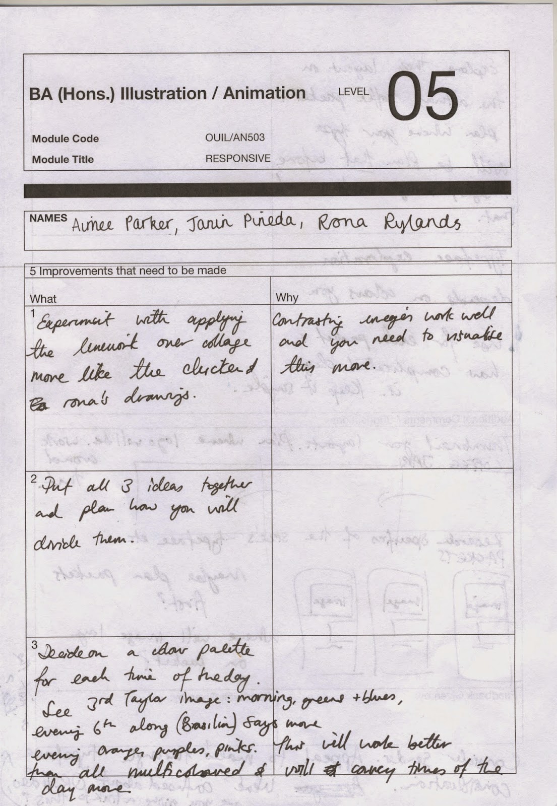
Responsive Collaborative- Feedback


Here is the feedback we got back as a group, we also got some verbal feedback about our work for the Taylors breif. The main points I need to focus on for this brief are:

- look into the type more
- look at the layout of the type on the product
- consider where you would place the QR code 
- write a concept statement 


Thursday, 12 February 2015

Responsive Collaborative- Meeting

Other questions we have asked ourselves other than the ones in the contact are: 

What problems can you for see? 

1) work load
2) backing up of work
3) illness

How will you address these?

1) the work load could get too much as we all have other projects to focus on and different things going on in our lives, to resolve this we shall help each other out when in need
2) make sure that we back all of our work up and keep copies just in case anything happens
3) if someone is ill we will have to divide there work between us

What are your priorities?

-concept
-idea generation
-colour
-pulling it all together
-documentation 
-keeping on track 

How will you achieve these? 

-attending sessions
-keeping on top of work 

Responsive Collaborative- Contract

This is our contact for this YCN Taylors Coffee Brief 

I am working with two illustrators: Janin Pineda and Rona Rylands


Why have you chosen to work with your creative partners?

Janin
I have chosen to work with my partners; Rona (llustrator) and  Aimee (graphic designer). Ronas has a very neat organized style in her illustrating whereas I am more experimental with my work. It will bring more structure to my drawings and idea generation and ill be suited more to product design. Aimee will also help with organization as the graphic designer and text, which we don’t have great experience in. She also works a lot in vibrant colours like me so we can include this in our designs.


Me
To work with people with a more illustrative style as this is an area I’m interested in. I have also chosen to work with my partners as I didn’t previously know them and this is how it is going to be in industry. We will work with each other on a professional level, as I don’t know them personally already. We have chosen the Taylors coffee brief as we all have a mutual interest in product design. I feel as if we will have a good cross over of skill sets. 

Rona  
Working with Janin and Aimee will give me a chance to cross over our illustrative/graphic skill sets and I will learn from aimee how to
give my work a more graphic aesthetic. Because we started this collaboration without knowing each other on a personal level,
we will work on this brief professionally.
As both Janin and I are illustrators, we think and work in a similar way and therefore will be able to pool our ideas and have more to work with. Working with Aimee will teach me how to give my designs more structure.

What are your specific areas of creative interest in this brief?

Janin
My specific area of creative interest in this brief will be drawing with collage and line and idea generation as well as research and constant documentation. I will modify images on Photoshop and help with backgrounds and textures and colour.

Me

My interests lie within layout, type and colour. I am interested in designing an new product for the age range that we are in. I also have a keen interest in research and idea generation. Having a clear concept will be key.
I will be project manager, meaning I am in charge of organising when things need to be done by, and organising who is doing what.

Rona

My specific area of interest in this brief will be the initial drawings for the production of work, as this will then be passed onto Janin for editing and then Aimee for final resolutions, layout and text.

What specific creative skills do you have to offer in relation to your chosen brief? How do you intend to use them?

Janin

I intend to use my drawing and exploration skills to help with the idea generation for the illustrated packaging. I think my editing skills are good on Photoshop and Illustrator which I will bring into this project.

Me

My skills being a graphic designer lie within type, layout and colour. I have more of a graphic aesthetic compared to the illustrators I am working with. I have a keen interest in hand rendered type, and enjoy working with a lot of colour. I am good at exploring different techniques to narrow down to a final design for the product.

Rona

As an illustrator, my skill sets are largely drawing based, I work with fine liner pens and work to a simple design aesthetic.
I have used hand drawn type in my work before and found this a strength of mine. I will also use my i9dea generation and explorative skills to base the later work.

What specific non-design skills do you have to offer in relation to your chosen brief? How do you intend to use them?

Janin

Non-design skills I can offer in this brief is research as I enjoy researching a brief and finding a concept, I like coffee so can also help input opinion and advice and critique. I will be documenting all along alongside my partners.

Me
I have good organization skills and can manage my time well. I have a good work ethic and like to get things done.

Rona
I have good organisation skills.
I work well if I have plans and deadlines. I think positivity is a good quality of mine, as it keeps the workload enjoyable.
I work well in a group as I know what I do affects them too.

What will your specific roles be in the collaboration in relation to your brief?

Janin
My individual responsibility in this project will be to manage my own time well and keep on top of everything. I will have to stay in contact with my partners and communicate with them well. I will have to stay organized and document things as I go on my blo

Me

We will need to keep in contact; we now have each other on social media for point of contact. It will be out own individual responsibility to turn up to sessions and not let the group down. We will also need to keep up with our own individual work and make sure we have equal work loads to make it fair.

Rona
My individual responsibilities in relation to the brief are keeping up to date, communicating well with the group, making sure we all have equal workloads and documenting as we go.

What will your joint responsibilities be?

We will all have the responsibility to research and generate ideas together. One of the main responsibilities will be to keep up to date with each other and where we are with the project. It will be a joint responsibility to chip in with money and budget the project well.
Our joint responsibilities will be to get the work we set ourselves done after group meetings. all going to split any costs. We will do any major decision making together, to avoid falling out and staying professional.