

Above are a few sketches of the front and back of the submission slip, in terms of quantity there would have to be hundreds of these printed.

I took inspiration from one of Tyler Spanglers patterns and created the pattern in the colours of my website.

I started to experiment with shapes and colour on illustrator


I made the design (above) but then realised that there is so many colours in the design and if I wanted to print hundreds to be handed around Leeds it would cost a lot to print as there is so much colour.

Above is a screenshot od how the design would look all together on the wall, I think it works well as it is a repeating pattern, the only thing that would concern me is the cost of printing it all.
To reduce costs I have thought about printing my design onto coloured paper, to keep the colour theme going that runs alongside my website.

I got some colour card in the colours of my website, I think this will work better and reduce the costs of printing considerably.


When printing a couple of tests I realised that I should change the size to A5, because even if I had the size as B5 it would still use one sheet of A4 per entry slip, but with A5 I could fit two per page. A smaller design is going to be much better. At this point I am getting really stuck and not liking what I am designing.
Postcards
I have had a brainwave instead of doing a 'submission slip' for people to display their own bit of hand drawn type for the festival, I think a post card would be better, I think it will work better in terms of design and it could be sent out to various designers/ design studios for them to submit a piece. The postcards could also be handed out around leeds and posted to other creative places and universities. I am going to start my design again.
Research into postcards


Mr Bingo- Hate mail
The Project
I love post and I'm worried that people don't get enough 'fun' post these days.
Especially postcards.
So I had an idea. It's very simple.
You send me fifty quid (plus postage) and I'll send you a vintage postcard with a
drawing and an offensive message on it. (that's why it's called 'Hate mail').
So you get an original signed drawing, the postman get's a laugh and the world
get's a little bit happier.
The rules
1. Each piece of postcard 'art' will be completely random.
You are not allowed any specific requests, you just 'get what you're given'.
2. If you're sending Hate Mail to someone else, please remember to change the name and address in Paypal so it goes to the right place.
3. This is only open to people from the UK (for now) I'm afraid, sorry lovely overseas people! You can of course purchase one from overseas, as long as it's being SENT to a UK address. I will also do another international round in the future, I promise.
4. Mr Bingo is not responsible or liable for anyone who suffers any mental damage or suicidal feelings as a result of receiving Hate Mail.
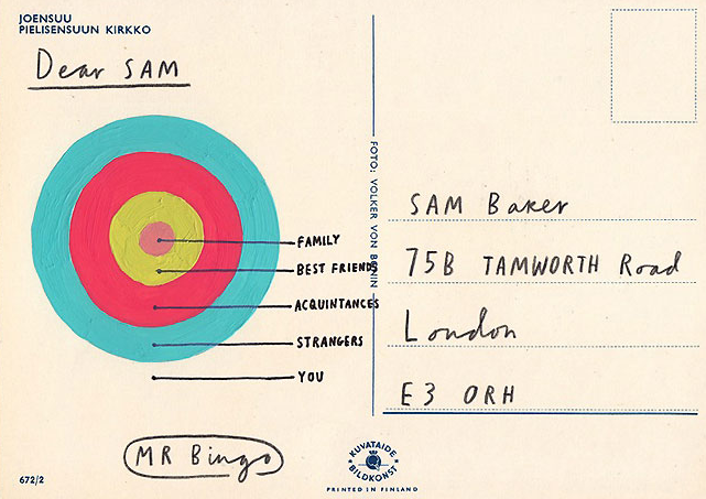
I really like the project Mr. Bingo did for hate mail sending people mail that they wouldn't normally receive, most of the postcards are offensive but thats what people like about them. They are attention grabbing keep sakes that people display as pieces of art.


Letter pressed postcards by Kerr Vernon
When GF Smith came in to visit us what really caught my eye were these postcards. The paper and the way they were printed really gave them a quality feel.
Packaged in a wax-sealed bellyband and housed in a card folder, the five letterpresses postcards within the package feature lyrics from songs by some of Vernon's favourite Glasgow-based bands.
"Everything was printed on duplex GF Smith colorplan, except the Frightened Rabbit postcard which was printed on triplex," explains Vernon of the thick, colourful and layered stock the postcards are printed on.

Above are some quick sketches of ideas for the postcards, I have to fit quite a lot of information on the one side as I want the other side to be where the user designs some type.


Above is the first design I have done, I have realised just how much information I have to fit on this postcard. I think I am going to keep the other side completely blank. The website needs to be one of the boldest pieces of information and kept in the same font as the heading.


The above two designs I have experimented with changing the colours of each word, the colours to match my website.

Again I have experimented with using shape and pattern in my work, I like the design above, it sticks to all of the do's and dont's in the project rational.

Above I was experimenting with how the design would look if I printed it off on coloured paper like the thamotropes, I think it would look good and reduce commercial printing costs however when the postcards would be displayed at the festival I think it would be better to be printed on white so people could add there own colour to there design.
I have decided to go for the colourful type design idea, this way I can make a collection of postcards with all different sayings to promote the festival and website
-do you love type?
-1st sign writing festival
-stay inspired
-create and get your work displayed
Postcard Grid

I have set up a grid for the postcards as it is going to be all type and I want to keep it organised. The green is where the address will go, the yellow is white space and the blue is where the design and information will be.

I printed out a test print and realised that the design is way to small at 5x3 inch, I need to make my design bigger but to fit at least 2 postcards per A4 page. With this design being so small the type feels quite cramped, so I have now decided to have the postcards 6x4.

I incorpriated the colour within each letter to make it bold and colourful

I then added a shadow onto the letters, I think this looks a lot better as the colour is still there but it is more readable.


Because there is a lot of letters on the '1st sign writing festival' I have tried out making each letter a different colour and each word because I am unsure whether each letter is too much and difficult to read. I will take both ideas to the crit and get some feedback.
No comments:
Post a Comment