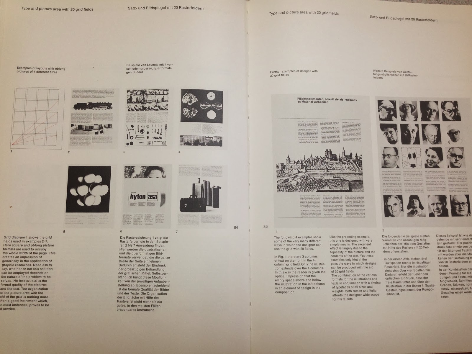
Here are my the print screens of the final designs of my 5 page layouts for brief 3. I have focused a lot on grid design and the designs of Josef Muller Brockmann.
I found his book on grid design most useful for this brief and I think grid design was a relevant thing to look into as signs are structured and formal so I wanted my page designs to reflect this.
I am happy with the way that my page layouts have turned out, they are quite formal and informative which is what I wanted to keep it factual. Looking into grid design was useful, I used the transport font in the end as that is what people recommended from the crit, as they felt the other font wasn't formal enough.


No comments:
Post a Comment