Friday, 28 February 2014

Type Journal- Tesco Carrier Bag


Handwitten 

Here I spotted some type on a Tesco carrier bag, its not what I'd normally expect from a Tesco bag, as there logo and brand type is quite formal having something handwritten changes it abit and makes it seem more fun. I like how Tesco are putting across a statement however each word works on their own so if you just see the bag at a glance you might just see the work 'reuse' and this still puts across the message, I think it works well and is different but still sticking to the Tesco theme with the use of colour. 


What is a book? Definitions

Grid- a framework of spaced bars that are parallel to or cross each other; a grating.

Columns- a vertical division of a page or text.

Gutters- the blank space between facing pages of a book or between adjacent columns of type or stamps in a sheet.

Margins- the edge or border of something.

Sub-heads- a heading given to a subsection of a piece of writing.

Paragraphs- a distinct section of a piece of writing, usually dealing with a single theme and indicated by a new line, indentation, or numbering.

Captions- a title or brief explanation accompanying an illustration, cartoon, or poster.

Drop caps- A large initial letter that drops below the first line of a paragraph, usually used at the beginning of a section or chapter of a book

Headlines- a heading at the top of an article or page in a newspaper or magazine.

Measures- ascertain the size, amount, or degree of (something) by using an instrument or device marked in standard units.

Pagination- the sequence of numbers assigned to pages in a book or periodical.

Imposition- the action or process of imposing something or of being imposed.

Thursday, 27 February 2014

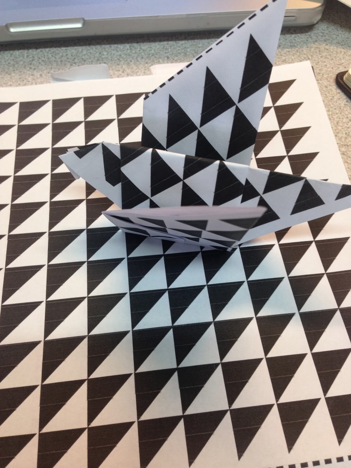
Communication is a Virus- Origami Instructions


To start off this project we took some origami books out from the library, these were so useful, looking at ways we can actually design the instructions for this brief, I think the easiest way of doing this is by drawing vector graphics.  


Here are just a few logo idea's I  have come up with for the name 'fold it' 
Other names I have come up with include folded, simple, blintz (a type of oragami fold), the origami project. 


I looked at existing origami logos for inspiration, I want the logo to be square and neat like origami itself also I would like it to be minimalistic.


Here are some very basic mock ups, I tried illustrating the vectors using illustrator, this went a lot better than I thought


Trying it out on a coloured stock, to see the impact it has. 


Here are the instructions I have designed, I found it tricky designing in such a small space, this is something I may have to consider however we also have to think about cost


I designed them using illustrator, with the pen and line tool, I think it has worked well, however when we design them fully I think they would look better on bigger paper sizes as everything would be less cramped. 


Folded Experiments and Developments


Here is a poster design that Helen has developed, the cut out letters has been inspired by Rob Ryan and his paper cut outs, I like it, what I like about it is that it sticks with the paper craft theme and the fact that it is hand made like origami. 


Here are some initial sketches of the poster


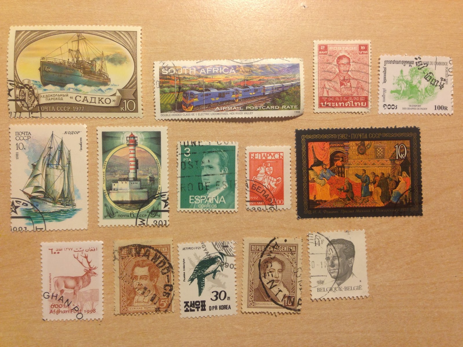
For the packs envelop incase that the envelopes aren't printable on, I thought we could maybe have stamps, I looked at some stamps I already have for the different sizes, I think this would be a nice touch.  


Here is some origami Typography that I have found that I really like, I like the 3D element of it and how it looks like actual paper. 


Here is a design idea if we can print on the envelopes, I have reverted it so there is white text on black background. I think this works well and will look like a sticker/stamp when it is printed. 

Monday, 24 February 2014

Questions

My five chosen questions for this brief are:


  1. What are the main atomical features of type?
  2. What are the severn colour contrasts? 
  3. whats the difference between RGB and CMYK? 
  4. How can type be arranged?
  5. What is the difference between readability and legibility? 

Possible questions for this brief are 

  1. should you kern?
  2. What are the differences between typeface and font family? 
  3. How can type be arranged correctly? 
  4. What are complementary colours?
Now I need to gather and source my own and other peoples in my groups research to use within my 10 page spreads. 


Grid and Book Design


I have took a book out from the library that I found particularly useful, I found it an interesting read and I feel as if I can notice different types of grid easier now. 


This was one of my favourite grids to look at, not your standard strait grid but one made up of a collage but still with structure. 


I also find looking at the existing designs useful, they have good examples that use that type of grid well. 


Golden Section 

Definition: 
the division of a line so that the whole is to the greater part as that part is to the smaller part (i.e. in a ratio of 1 to 1/2 (√5 + 1)), a proportion which is considered to be particularly pleasing to the eye.

Some graphic designers are fascinated with the golden section and use it to create various grids and page formats-indeed, entire books have been written on the subject. Other designers believe that the golden section is no more valid as a basis for deriving sizes and proportions than other methods, such as beginning from standard industrial paper sizes, or dividing surfaces into halves or squares, or simply picking whole-number page formats and making logical divisions within them.


Above is an image of the golden section, it is used found within nature as well as graphic design. 


Book Design

Some terms within book design 

  1. Text Block
    The Text Block or Book Block is everything between the covers of the book including the endpapers. It is composed of pages, leaves, sheets, and signatures. One sheet of paper, folded in half is two leaves and four pages. One half of each sheet of folded paper is a leaf. Each side of each leaf is a page. A signature is two or more sheets of paper (2 leaves/4 pages) stacked and folded as a group. Several signatures are bound together with adhesive or stitching to form most books.
    Each printed page of the text block contains an area known as the type page - the area of a printed page excluding non-printing areas (margins, gutter) as well as some printed areas including headers, footers, and page numbers.
    • Front Matter
      So called because it is all the material that appears at the front of the book, before you reach the actual body content, the front matter may be as simple as a single title page or table of contents or it could have multiple title pages, a detailed table of contents, and several pages for the preface and foreword.
    • Body of the Book
      The body of the book is where you'll find the story, the description, the main text of the book. This is the main portion of the publication. In longer books and manuals the body is often sub-divided into chapters or sections.
    • End of the Book Components
      The number and type of sections that follow the final chapter vary by the type of book. Technical publications generally have more of these end of the book componentsincluding an index and an appendix.
  2. Case Components and Book Binding
    A basic knowledge of the parts of a book and how a book is put together can help the designer envision the finished product. The boards, spine, and cover material make up the case which is created separate from the text block and attached to it.
  3. Miscellaneous Parts of a Book
    The designer may be involved in the selection and design of several additional parts of a book including:
    • Bookplate
      A plain or decorative paper label glued to the inside of the front cover or front endpaper that indicates the name of the book owner. It may include a space for writing the name with a pen or bookplates can be printed and affixed to all the book owner's collection. Decorative bookplates may include fancy type, personal quotes, or illustrations.
    • Fillet
      A decorative line or band impressed on the book cover.
    • Inlay
      An illustration or other decorative element set into the cover of a book or inset in a border or frame of paper.
    • Onlay
      A decorative panel of paper or other material superimposed onto the book cover.
    • Tabs / Thumb Index
      Often seen in reference books, tabs are small pieces of paper, card, or fabric attached to the fore-edge of a book and stamped or printed with letters, words, numbers indicating alphabetical or subject organization of the text. Dictionaries, encyclopedias, and Bibles may have a thumb index where a series of half-circular notches or tabs are cut into the fore-edge of a book.
    • Throwout
      A wider than normal leaf folded so that the reader can fold it out for viewing. A throwout may contain maps, tables, diagrams, or photographs that need to be larger than the other pages of the book.


Wednesday, 19 February 2014

Type Journal- Hair dressers


I walked past a hair dressers in Leeds and noticed this hand rendered type, it reminds me of sign writing, I love the use of different typefaces and how well they work together. I also think there is good use of type hyraci, my favourite type of these is the script like one. 

Type journal- Grand Arcade Leeds


I spotted the 'Grand Arcade Leeds' sign when walking through Leeds. I really don't like the type, I don't like the curves used and personally I think it just looks ugly and dated, with the curve it reminds me of something off a powerpoint presentation. 

Type Journal- Foreign Vodka Bottle


The type on this vodka bottle caught my attention I like how the two typefaces work well together and they have chosen good strong primary colours that stand out. The 'Nordfjord' word stood out most, I really like the typeface and how they have added extra definition to it by adding a small shadow. The word is all in lower case however the x height is at the top so the n is bigger. 

Saturday, 15 February 2014

Defining Page Layout in Magazines


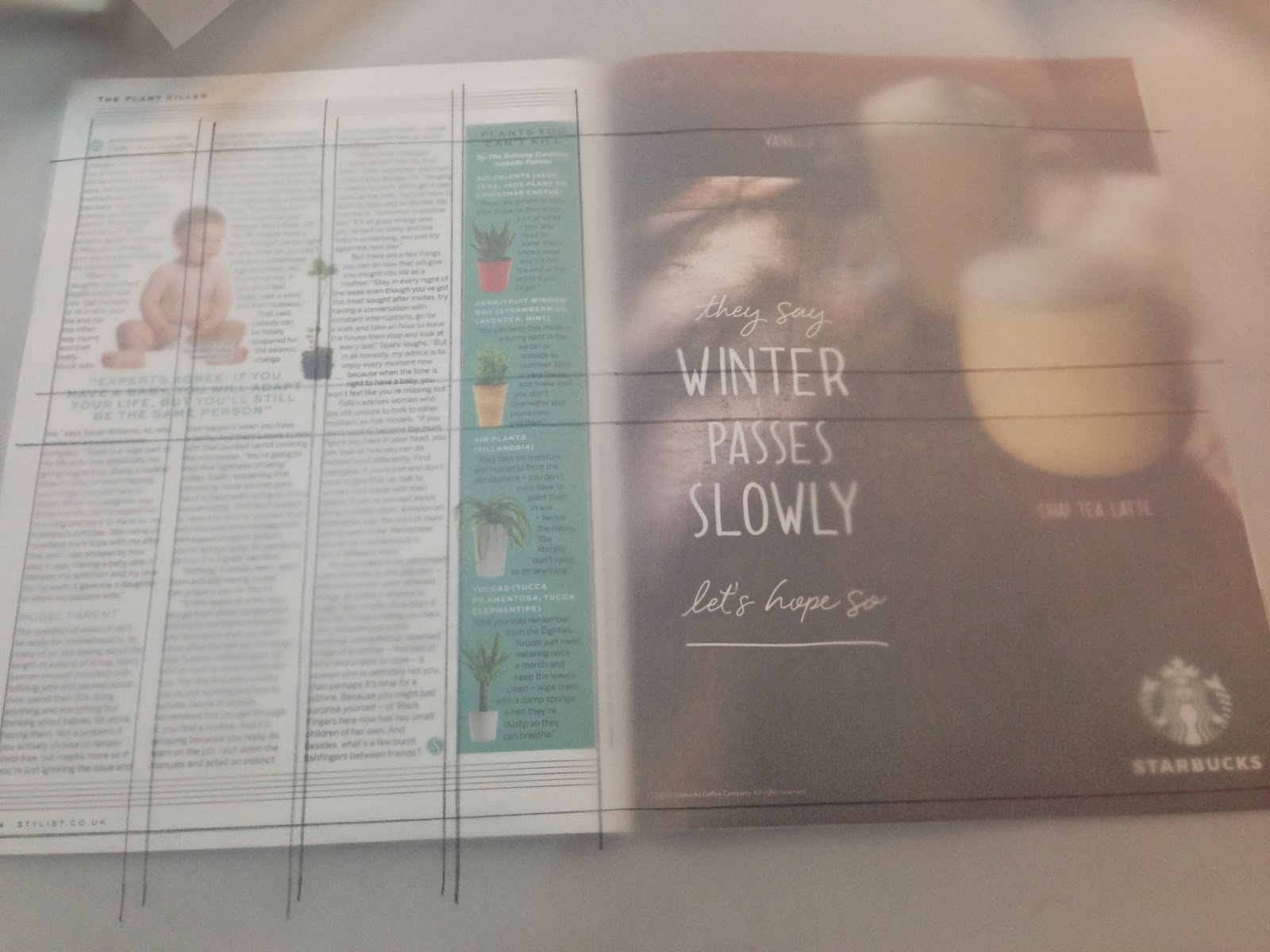
Here I have been defining the page layouts within magazines looking at their double page spreads. I placed a piece of tracing paper over the top and marked out where the guide lines for design are. The one above has a very simple design, with four images on the top row and six columns of text below. 


In the next magazine that I looked at, I defined the layout on one page and then flicked the page over and placed the tracing paper over the top, I then realised that the pages have very similar page layouts and there isn't much difference, above I have put added the two images. They both have the same four columns and a title or a subheading in the middle to break the page up a bit, I like this style I think it gives the magazine some consistency. 


Here is the third magazine double page spread that I looked at, I think this layout was a bit more creative. I put the grid over the top and you can defiantly see a clear structure in the page, both pages consist of two columns with use of text and imagery. 


Wednesday, 12 February 2014

Brief 1- Secret 7- Combining Experiments for Final Design


Experimenting with different overlays on the images


For my final design I am going to go for some mirrored/ geometric pattern of Leeds architecture with a marble pattern over it to add some colour. I have taken a variety of images of leeds architecture, I now just need to choose one that I like best and manipulate it. Here are the results so far, I am pretty happy with them, I think they are interesting and work well. 


Brief 1- Secret 7- Mirroring images


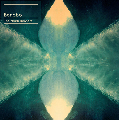
I felt pretty inspired by looking at Bonobo's album artwork and videos, they all use reflection/ mirrored images, I thought this could look interesting with Leeds architecture, so I have been experimented with mirroring in photoshop and below are just some of the results. I think I may experiment and manipulate further with these as I like the patterns.