


Here I have been defining the page layouts within magazines looking at their double page spreads. I placed a piece of tracing paper over the top and marked out where the guide lines for design are. The one above has a very simple design, with four images on the top row and six columns of text below.

In the next magazine that I looked at, I defined the layout on one page and then flicked the page over and placed the tracing paper over the top, I then realised that the pages have very similar page layouts and there isn't much difference, above I have put added the two images. They both have the same four columns and a title or a subheading in the middle to break the page up a bit, I like this style I think it gives the magazine some consistency.


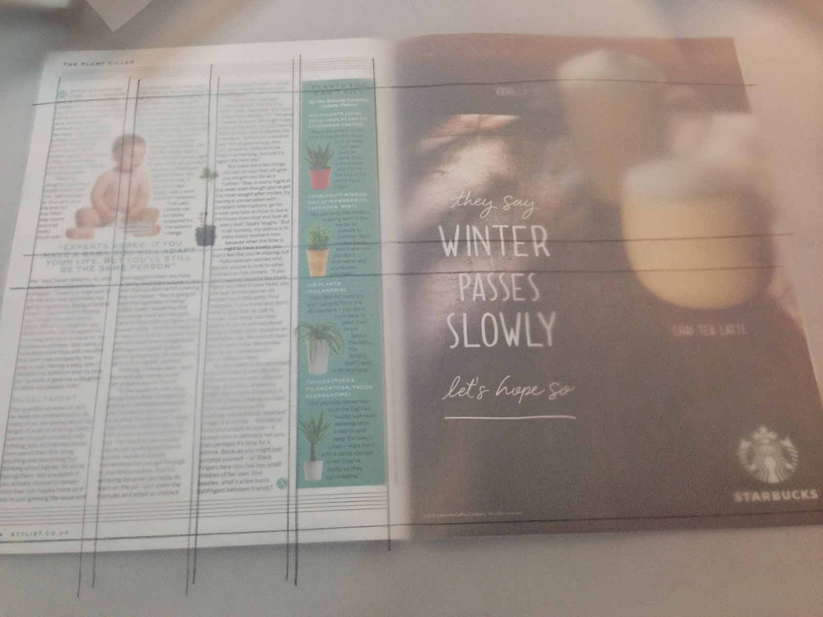
Here is the third magazine double page spread that I looked at, I think this layout was a bit more creative. I put the grid over the top and you can defiantly see a clear structure in the page, both pages consist of two columns with use of text and imagery.
No comments:
Post a Comment