Monday, 31 March 2014
Page Layout Feedback
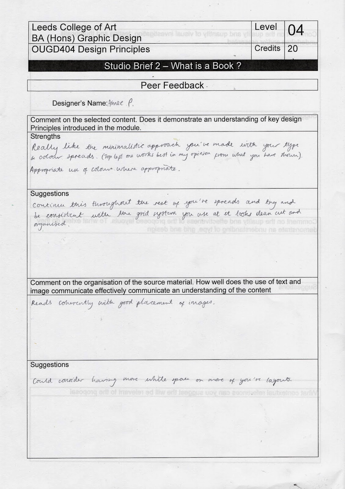
I received some feedback on my thumbnails of my page layouts that are in progress.
Comment on the select content. Does it demonstrate an understanding of key design principles introduced in the module
Strengths-
Really like the minimalistic approach you've made with your type and colour spreads, you have appropriate use of colour where appropriate.
Suggestions-
Continue this throughout the rest of you're page spreads and try and be consistant with your grid system you use as it looks clean cut and organised.
This is the most useful piece of feedback that I received, I do think I need to consider my grid more.
Sunday, 30 March 2014
Saturday, 29 March 2014
Type Journal- Leeds Print Festival
A print that I made at Leeds print festival, I like how the moveable block type works together with the hand finished feel.
Type Journal- Desigual
The logo for desigual is done in Helvetia however I like how they have made it unique by simply making the s backwards, I think it really works well.
Friday, 28 March 2014
Type Journal- Stylist
Really like the front cover of stylist, the hand drawn colourful type is really eye catching from a distance.
Type Journal- 99p Store
Today I noticed that the 99p Store used comic sans in their logo, its such an ugly logo, just looks like they couldn't be bothered.
Type Journal- Heaven
Really don't like this logo. I just don't understand why they have used a lower case e in a different typeface, I think it looks ugly.
Type Journal- Hallmark
I love Hallmarks logo, the H and and the k make the logo, I like how it looks handwritten like a handwritten card.
Type Journal- Levi's
I really like the typeface use on Levis Logo, I like how all the letters are in line and have the same cap height.
Type Journal- Cath Kidston
A script typeface for the Cath Kidston is in a script typeface, I really like how the C and the K are bigger than the other letters.
Wednesday, 26 March 2014
Type Journal- Jumbo Records
Love this type and how it is shapped into an elephant, I think its cleaver how they have used the legs as the 'M'.
Type Journal- Poster
A poster I noticed with some textured type, I think the texture works well with the wood background.
Subscribe to:
Comments (Atom)


