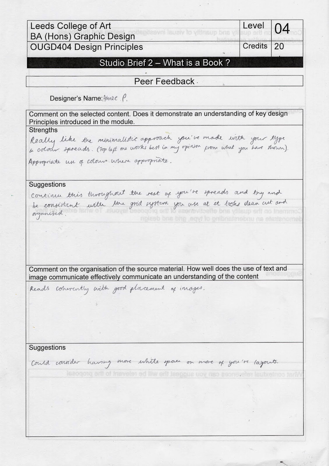
I received some feedback on my thumbnails of my page layouts that are in progress.
Comment on the select content. Does it demonstrate an understanding of key design principles introduced in the module
Strengths-
Really like the minimalistic approach you've made with your type and colour spreads, you have appropriate use of colour where appropriate.
Suggestions-
Continue this throughout the rest of you're page spreads and try and be consistant with your grid system you use as it looks clean cut and organised.
This is the most useful piece of feedback that I received, I do think I need to consider my grid more.


No comments:
Post a Comment