Here are my final designs of thaumatrope's, I decided to make these as sign writing is an old fashioned talent and a thaumatrope is a old fashioned form of animation usually used for moving images. I decided to print the finals on coloured paper the same colours used within my website to keep it consistant. These would be printed in mass to promote the website and the festival, so only using black ink keeps the printing costs down. It has taken many attempts to get the design right, many print failures and design faults due to the movement within the design. I have stuck to using Helvetica throughout as my website only uses different varieties of Helvetica, it has kept the design bold and simple.
As sign writing is quite an old tradition, I thought I may need a old interactive element to my design, so I have began looking into thaumatropes. What is a thaumatrope?
A thaumatropeis a toy that was popular in the 19th century. A disk with a picture on each side is attached to two pieces of string. When the strings are twirled quickly between the fingers the two pictures appear to blend into one due to the persistence of vision.
Using the same technique I experimented with my own
First Attempt
When spun the above thaumatrope you couldn't read the text that well, I think I may experiment with one with less type but still advertising my website
Second Attempt
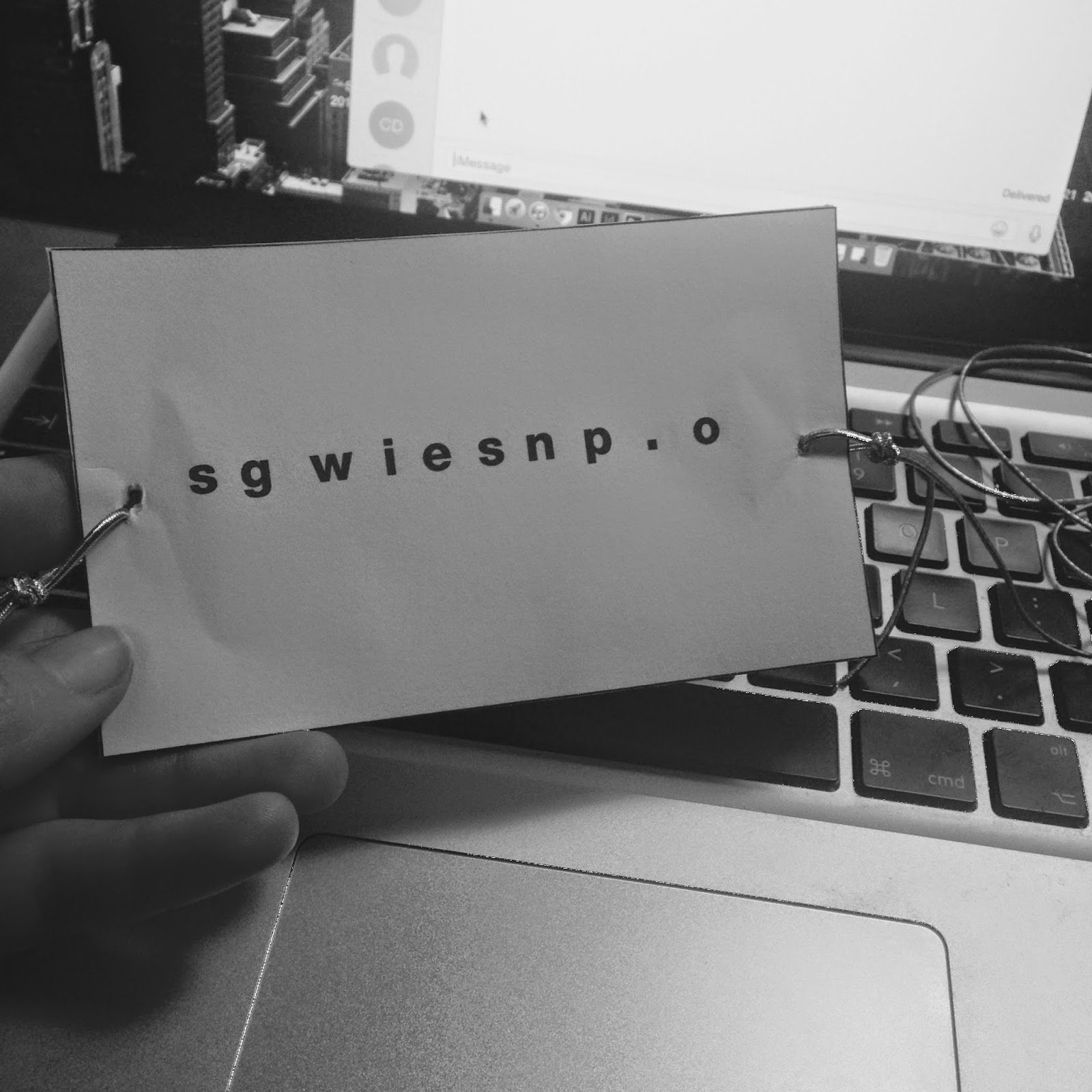
I set out the design on illustrator, and kerned each letter individually so it all hopefully fit together when spun and read 'signwritersinspo.com'
I printed a test out and stuck it together, I have realised I have stuck them the wrong way around for it to read when spun. This has been a good mistake as now I understand how thaumatropes work better, also I think I should add a shadow onto the type so its the same style as the heading on the website.
Third attempt
When I did it again I put the two squares together in illustrator so I would just fold the design and it would be the right way round. This has worked alot better, but you still can't read it that well.
Forth Attempt
With this I changed the shape to make the design a bit more interesting, when I started to spin this one 'stay inspired' shows up more because its all in black, I think I am going to re-design this again and have the website in black and the 'stay inspired' in just an outline. Fifth attempt
I changed the type around to say 'stay inspired' just in as an outline and 'www.stayinspired.com' in black, when the thaumatrope was spun you can't read 'stay inspired' very well, so I think I am just going to put all the type in black, this is going to be a very simple design but hopefully effective as it is interactive.
Sixth attempt
Here is another attempt of getting the type clear and readable on the thaumatrope, on this one again I feel as if the 'stay inspired' is a lot clearer again because of the black background, I am going to experiment with this design again and swap them around.
Seveth attempt
Above is another attempt of the thaumatrope, this has worked a lot better changing the type around. The only problem I have with this now is that most thaumatrope's have some element of something happening or movement, so I think I am going to experiment with some shapes that could move. You can read this one a lot better, the video doesn't really do it justice.
Eighth attempt
Here I experimented with a moving boarder using pentagon shapes a bit like a spirograph, I like this idea however I feel as if its a bit distracting from the type and there is too much going on, the design needs to be much simpler. I prefer my last idea now, I am going to make these smaller and print them on coloured paper, the same colours used in my website.
why: for creatives to come and show off their sign painting and for people to appreciate sign writing more
I have decided to advertise a sign writing festival as an extension to my website, I have chose to hold this event outdoors as larger pieces of sign writing on the side of verchiles ect would be on exhibit. I would also like to have some live artists painting so people can ask questions. There will also be a beer tent, live music and a small arts and craft tent. I would like to people to leave this event feeling inspired. I want the festival to be bright colourful and to represent sign painting well.
Artists and signwriters to attend:
-Keith Harring
-Steve Powers
-Steve Evans
-Fred Fowle
-Kate Moross
-Tyler Sprangler -Sean Barton -Gary Martin -Ira Coyne -Sean Starr -Mike Meyer -John Downer -Jeff Canham -Damon Styer -Josh Luke
Keith Haring
Steve Powers
Kate Moross
Tyler Sprangler
Sean Barton
Gary Martin
Ira Coyne
Sean Starr
Mike Meyer
John Downer
Jeff Canham
Damon Styer
Josh Luke
Now I have a better idea of what augmented and interactive design is I can start to think of things I can do that would be relevant to my campaign. Augmented ideas Augment: tomakelarger;enlargeinsize,number,strength,orextent;increase -posters -billboards -side of bus -bus shelter -leaftlets -newspaper/magazine advert -mail/direct mail
Interactive ideas
-thaumatrope -something to submit to the festival -interactive poster -QR codes -pop up book -scratch off design
"For the cover of the November issue we and our cooperation partners have pulled out all the stops to produce something very special. In 48,000 passes and with 140 extremely detailed die cuts per magazine, we createdsix differently coloured versions of the cover, without exposing the plates again each time. The result is a metamorphosis of paper, inspired by the one and only Richard Buckminster Fuller."
I really like this idea of having the front of the magazine interactive and moveable making the want to pick it up and play with it.
Again I really like this idea for die cut book marks, with the rise of iPads and Kindles it is important to hold a real book in your hands from time to time and Paperlux re invented the book mark to make it more interactive and user friendly. This bookmark seems more like a present and has more value than your standard bookmark as it is more interactive.
PULL TABS
Above is an example of a leaflet that uses pull tabs to show information, I think this is a good idea because the user has to do something to reveal the information making them more likely to read the information rather than having it in a boring leaflet.
This is an interactive pull tab poster for alzheimer's, again it gets the user to interact making them more likely to take notice of the poster and the message behind it.
Here is a pull out book designed for children, for them to learn about flowers and science, by making it more interactive it makes the information more memorable, rather than just reading out of a text book.
This is an interesting interactive print design by Lacoste, each page has something that pops up. The book includes digital interactive elements pull outs and add ons, all promoting the 'L!ve' branding.
This is an interesting project based on Hungary, a pup up illustrated book all about Hungary, the pop up elements don't bore the user it keeps them entertained and engaged.
SPECIAL INKS / PAPER
Heat sensitive
I like the idea of using heat sensitive inks to make the design more interactive, the images above are of some print that use heat sensitive ink and the ink reacts to the heat of your body so as you are touching it the design changes, I think this is a really cleaver idea but I am unsure on how expensive this ink would be.
Light sensitive paper
Light sensitive paper could be a good way of making my design interactive as when the image gets exposed to light it will slowly appear
SCRATCH OFF DESIGN
I think this is a good idea for interactive design as it reveals more of the design and make the user want to scratch it off and engage. I love doing scratch cards so i would definitely do this is this was part of the design, it would be good if it revealed an interesting fact or a relevant piece of information.
QR CODES
I have never scanned a QR code in my life and I have a smart phone, I don't think most people bother but I do think there is huge potential with them. They could load a whole new webpage, advertisement or a secret message.