
As sign writing is quite an old tradition, I thought I may need a old interactive element to my design, so I have began looking into thaumatropes.
What is a thaumatrope?
What is a thaumatrope?
A thaumatrope is a toy that was popular in the 19th century. A disk with a picture on each side is attached to two pieces of string. When the strings are twirled quickly between the fingers the two pictures appear to blend into one due to the persistence of vision.

Using the same technique I experimented with my own
First Attempt


When spun the above thaumatrope you couldn't read the text that well, I think I may experiment with one with less type but still advertising my website
Second Attempt


I set out the design on illustrator, and kerned each letter individually so it all hopefully fit together when spun and read 'signwritersinspo.com'
I printed a test out and stuck it together, I have realised I have stuck them the wrong way around for it to read when spun. This has been a good mistake as now I understand how thaumatropes work better, also I think I should add a shadow onto the type so its the same style as the heading on the website.
Third attempt

When I did it again I put the two squares together in illustrator so I would just fold the design and it would be the right way round. This has worked alot better, but you still can't read it that well.
Forth Attempt

With this I changed the shape to make the design a bit more interesting, when I started to spin this one 'stay inspired' shows up more because its all in black, I think I am going to re-design this again and have the website in black and the 'stay inspired' in just an outline.
Fifth attempt
Fifth attempt

I changed the type around to say 'stay inspired' just in as an outline and 'www.stayinspired.com' in black, when the thaumatrope was spun you can't read 'stay inspired' very well, so I think I am just going to put all the type in black, this is going to be a very simple design but hopefully effective as it is interactive.
Sixth attempt
Here is another attempt of getting the type clear and readable on the thaumatrope, on this one again I feel as if the 'stay inspired' is a lot clearer again because of the black background, I am going to experiment with this design again and swap them around.
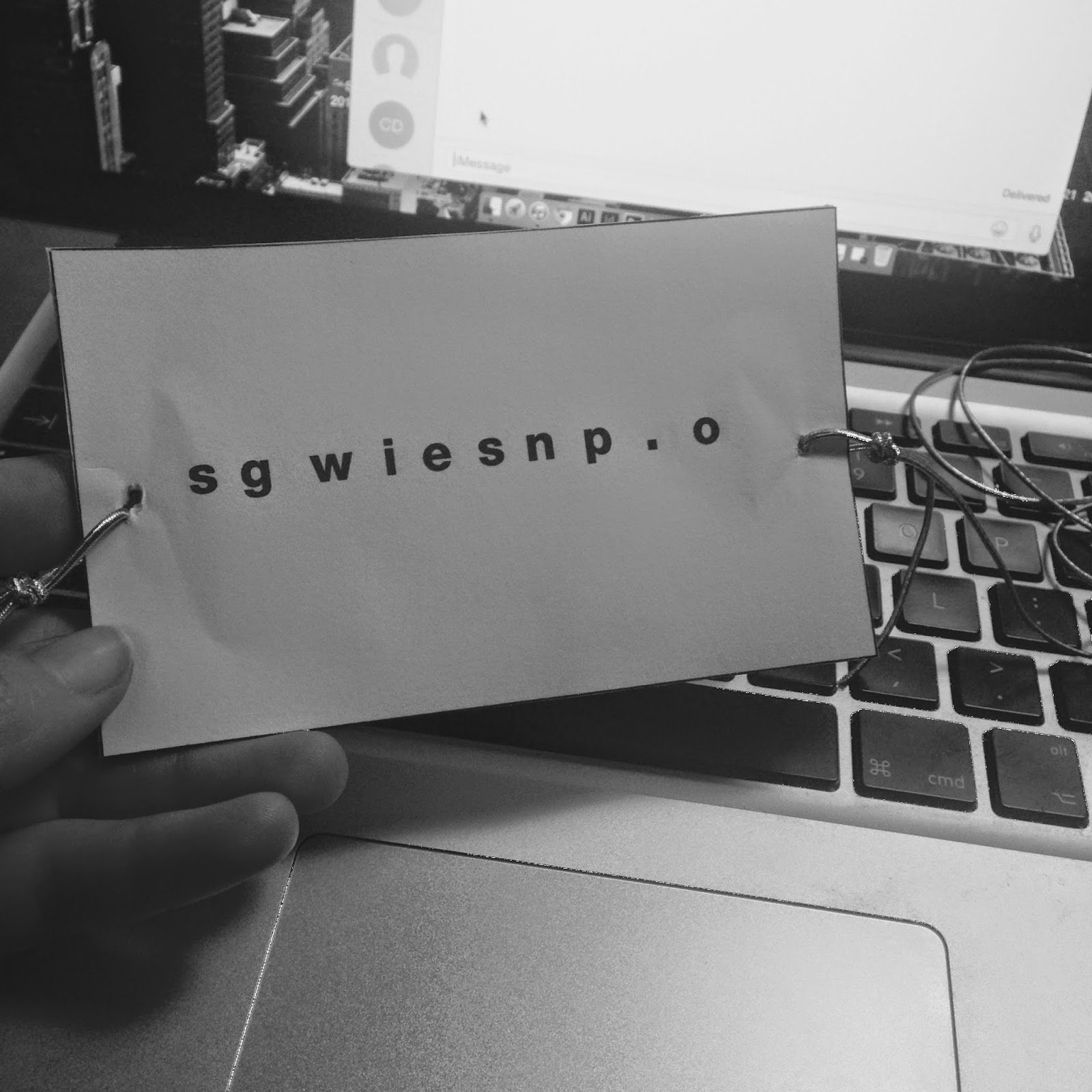
Seveth attempt
Above is another attempt of the thaumatrope, this has worked a lot better changing the type around. The only problem I have with this now is that most thaumatrope's have some element of something happening or movement, so I think I am going to experiment with some shapes that could move. You can read this one a lot better, the video doesn't really do it justice.
Eighth attempt


Here I experimented with a moving boarder using pentagon shapes a bit like a spirograph, I like this idea however I feel as if its a bit distracting from the type and there is too much going on, the design needs to be much simpler. I prefer my last idea now, I am going to make these smaller and print them on coloured paper, the same colours used in my website.

No comments:
Post a Comment