Wednesday 25 March 2015

OUGD503- Responsive- End of Module Evaluation


This module has developed my graphic design practice in all areas. I have thoroughly enjoyed this module and having live briefs to work on seeing my work out there. It has opened my eyes to the real world and graphic design.

The first project that I worked on was the cheese society as I was promoted the graphic designer. This is an on going project that is still going now. I can see how my designs have developed throughout this project, looking back at my first design now I know where I went wrong and how I could improve my designs. My process was a lot of hand drawn type and sketching to get it right, I then scanned in all of my designs and added them to illustrator and Photoshop. I have developed a lot of skills on illustrator through out doing this brief.

The next project I worked on was the Ohh Deer.com cushion design brief. This brief was completely open and there were no requirements other than for it to work with the brand. The competition was voted for online by how many likes shares and tweets your designs got. I knew I wanted my cushion designs to be bright and colourful to add some colour into any room. I also wanted texture within my design so I decided to experiment with paint and cling film. The cling film allowed me blend the colours and add texture. I added paint to the paper and got piece of cling film lifted the cling film and transferred it to another piece of paper to create a unique pattern. Overall I was really happy with my designs I think they fit in with the brand well.

I also did an advert for Nest the student magazine for Leeds College of Art for Sela Bar in Leeds a bar that specialises in cocktails, pizza and unique beer. I researched into Sela Bar and their previous designs and found they used a lot of red and blue in their designs so I used this as my colour palate. I used hand drawn type and an illustrative design making the type look like the actual thing for example the ‘Pizza’ type to look like dripping cheese and the ‘Beer’ type to look like the refreshing bubbles of beer. On the advert I also included the icons to their social media sites including their Facebook, twitter and Instagram.

I was approached by my fried Jack Read to design a logo for his radio session in Manchester ‘PD Sessions’. I found this logo quite difficult to design. He showed me what another designer did for him and explained why he didn’t like it. He told me that he would like a graffiti style and showed me images of styles that he likes. I initially thought of designing him something hand drawn and graffiti, after a while of drawing my designs I realised it wasn’t working. The graffiti style that Jack wanted made it look quite tacky and after my research I noticed that all of the designs for radio station logos were very simple and clean designs. I explained my issues with Jack and sent him some images of some moc up ideas that I had and he loved the idea with the mic and understood what my issues were. The overall logo looked nice and simple it only needed to be in black and white, Jack also wanted it in inverted colours for use elsewhere. The ‘PD’ is the icon he is going to use on his Youtube channel and other social medias and for the end of e-mails, letter heads etc he will use the full logo.

Feathr was another brief I did, it caught my eye as I am interested in pattern design. I wanted the wallpaper to tell a story and to include colour and texture. I decided to base the design on the Grande Palace in Thailand a place I visited and admired in the summer. I wanted the wallpaper to have an oriental feel. I researched using library books on pattern design and researching into artists online such as Cath Kidson and Tyler Spragler. The design we made needed to be a repeat pattern and look right when repeated. I experimented a lot digitally using illustrator and adding textures on Photoshop. The vectors are simple colourful but I still think they show oriental and Thiland well.

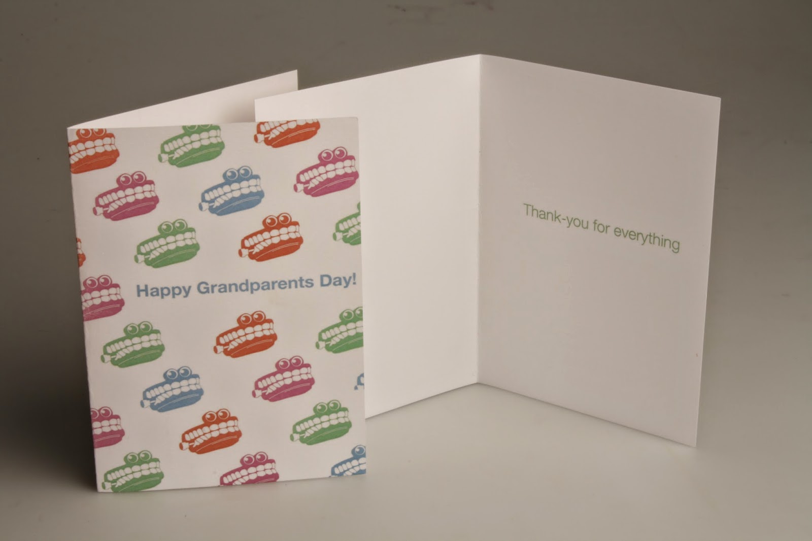
I wanted to leave enough time for a YCN or DandAD project and I did. After much reading of all of the briefs I finally settled to do Interflora, the brief was to make younger people more aware of grandparents day, after further reading into the brief it went on about young people who don’t see their grandparents as often as they would like and sending them flowers to celebrate grandparents day. I researched into grandparents and the products out there already, they all went for quite a humours tone so I decided to do the same with my campaign but still get the tone of voice right for Interflora. I used a simple character design of some chattering teeth thought the whole campaign to keep it consistent.

This has been my favourite module of uni so far as I have enjoyed doing the live briefs. I have seen my work develop throughout each brief. There were other briefs I would of liked to have done for this module but there just wasn’t enough time.

Surprisingly I think I have managed my time effectively thought the briefs, I have enjoyed working on all of the briefs equally and have really expanded my skills.

Saturday 21 March 2015

Responsive Collaborative- Taylors Coffee- Evaluation

OUGD503- Collaborative Practice- Taylors Coffee Evaluation

We chose this brief as a group as we all have a key interest in product design and packaging and it is something that we all want to develop more. I chose to work with illustration, as this is an area I am partially interested in. I have also chose to work with people I didn’t previously know as this is how it is going to be in industry.

The first thing we did as a group is write up a contract confirming what our strengths are and what we can bring to the team. What I felt I could bring to the team was my knowledge of type and layout, one of my biggest strengths is also organization. After speaking to Janin and Rona they told me how they would like more structure and organization in their work, I thought I can defiantly help them out with this. I was chosen to be project manager meaning I am in charge of organizing when things need to be done by, and organizing who is doing what.

The next step was to research; we researched into many areas including Taylor’s coffee as a brand, coffee its self and where it comes from and how coffee is processed, this was useful in giving us some background knowledge. One mistake we did make when we started this project is that we didn’t realize that we had to make a ground coffee product and we were thinking of ideas for instant coffee instead, after a couple of re-reads of the brief as a team we eventually started to generate some ideas.

To gather some primary research we set up a survey on survey monkey and asked our target audience many questions about coffee, how much they pay, what brand they normally go for, do they know how to use a cafetre etc. We got some useful feedback back and this helped us a lot with our concept for the new Taylors product.

Our concept based on our primary research is to have a new decorative illustrative jar that young consumers would want displayed in their student house. Along side the glass jar we would also design three packets for morning, daytime and evening depending on when you drink coffee most focusing on occasion. The morning coffee would give you that morning boost to wake you up, the daytime one is to keep you going through out the day and the night time one is a decafe to chill you out after a long day.

To get some ideas going in terms of design of the product we all went away and chose either morning, daytime or evening and made some collages of things that remind us of that particular time of day. This helped a lot before putting the final design together because we all got a say in what we would like in the design, and why we think it would be suitable.

My main parts for this brief was the type and layout, so I started to look into the type and layout on Taylor’s products. I researched into previous layouts and type within Taylors coffee and found that the type and layout they have now is defiantly their strongest. One element we also wanted to bring to the product is interactivity with the use of QR codes. This would be a good way of the younger customer scanning the QR code and for it to load a video of how to make the perfect coffee.

One main concern I did have with this brief was how I was going to mock up the design on foil packets and to still make it look good and realistic. Before the final design got sent over I practiced with an image off the Internet to make sure I could get the technique right. The final design then got sent over set up on a 7x40 cm canvas document, which is the perfect size for the sticker on the jar, however when I mocked it up I need the design to be bigger as every time I resized it for the packet it went blurry. The moc ups being blurry was defiantly the biggest issue we had with this brief, but unfortunately there wasn’t much we could do.


Finally we printed the label and booked out a photography studio to photograph the final product. The most difficult thing about photographing the glass jar was getting the lighting right on the glass. Overall this has been a really enjoyable project to work on and I am really happy with the final outcome, as a team we have all worked well together and combined our ideas to come up with this new Taylors Coffee product.

YCN Interflora Grandparents Day- Evaluation

OUGD503 Responsive YCN Interflora Evaluation

I chose this brief after reading it in much detail. The aim of the brief is to boost awareness of grandparent’s day to a younger audience, when read in further detail it goes on about when younger students don’t see there grandparents as much as they would like due to other commitments. I have previously never heard about the brand Interflora because I have never ordered flowers, but I do think they have a valid reason for their campaign. They want young people to sent their grandparents flowers to let them know that y are thinking of them on grandparent’s day.

The first thing I did was research into Interflora as a brand and their competition. The first obvious thing I did was visit their website. The immediate reactions of the website was dull and boring, it didn’t excite me or make me want to purchase any flowers. The website is defiantly aimed at middle-aged women. I noticed that many of the links were on the website multiple times and that there is a white banner down the side of the website because the sizing isn’t correct. Looking at the competition I noticed that their websites are much more clear crisp and less over crowded.

To get some ideas flowing I then did some primary research into grandparent’s cards to see what tone of voice they usually go for. I visited Marks and Spencer’s and paper chase for this, and realized that most of the cards go for a humors tone of voice for grandparents. Following on from this I then decided to make some lists of what grandparents like and sketched out a few ideas.

My two main ideas for this campaign is the a seaside/ day out campaign as this is one of the main things I used to enjoy with my grandparents and the other one being some chattering teeth to add a humorous tone to the campaign.

I went for the chattering teeth idea and managed to find a pair of chattering teeth, I photographed them, printed and illustrated the teeth. This came out a lot better than I originally expected. The hardest part of the illustration was getting the eyes right, getting them to look in the right direction and not to be scary. I wanted to add some colour to the campaign as I am not a massive fan of the company’s colours being black and gold, I understand that they want a high quality/ high end look however I don’t feel this colour palate would fit in well for the younger customer.

Once I designed the chattering teeth that was the main icon for the campaign, I used it across a variety of outcomes from print to web and mocked them all up to show the range it could work across. I am happy with the way that the teeth have turned out and I think it works well on all platforms; my partially favorite outcome it works on is the flower paper.


I booked a photography studio to take my final photos of the product range for YCN and for the photos to look more professional on my design boards to send to them. The biggest problem I had at the shoot was actually wrapping the flowers and the lighting, the images didn’t  turn out as well as I would of liked, but in the future now I realize that I might need to ask a friend to help me while shooting products. One thing I do want to work on is my tone of voice when writing on design boards, I sometimes find that the most difficult part of the project, this will be something I need to develop and improve in the future.

Friday 20 March 2015

YCN Submission

E-mail conformation from YCN for submitting both Interflora and Taylors Coffee


Wrapped Collective Submission

WrappedCo is a non-profit print collective, dedicated to printing and sharing the creative work of designers, illustrators and artists with the public through the medium of gift wrap.

Many take something as simple as gift wrap for granted, and forget it not only has a functional purpose, yet it can be beautiful, exciting and creative.

Whilst inviting creatives to take part in this project, not only are we collectively engaging with the medium of art, inspiration and thought, we are also sharing gift wrap with others internationally, leading to connections, self-promotion and creative diversity.

Designers, illustrators and artists can submit digital prints to WrappedCo, in order to be featured in our online gift wrap gallery. Each print will then be printed, wrapped and shipped accordingly to purchase.


The Brief:

Create a print for gift wrap; it could be anything.

Guidelines

Print: WrappedCo suggest a pattern based print usually works best for gift wrap, however you have free reign if you think something else would work; be creative and express yourself.

Format: A2, Portrait

File Type: .pdf, 300dpi


Here is my submission for gift wrap using three colours that are suited for men and women for birthdays and other occasions. 

Wrapped co online gallery 


YCN Interflora Grandparents Day- Final Boards

Here are my final design boards for YCN Interflora explaining all design decisions. 


Responsive Collaborative- Final Boards

Here are my final design boards for YCN Taylors Coffee explaining all design decisions. 


Sunday 15 March 2015

YCN Interflora Grandparents Day- Photoshoot

Images from photoshoot

Here are a few images from the photoshoot, this was quite a difficult one to shoot as I wasn't too sure how to wrap flowers properly and once they were wrapped I didn't know what angle to get the photos from. The lighting was another issue I had with this shoot. In the future I am going to photograph my work more to get more practice with the lighting layout etc. 


Responsive Collaborative- Photoshoot

Images from photoshoot

Here are the a few images from the photoshoot of the glass jar, the hardest thing about this shoot was lighting the glass jar right. I am happy with the way most of them have turned out, I found it a lot easier to shoot when I started to use a tripod. I will add them to photoshop edit and put on boards.