Saturday 21 December 2013

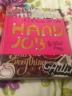
Type Journal- Hand Job


Hand rendered

Here is a book that I repedidly take out of the library for inspiration on type, I like it so much because it is not done on the computer, but by hand. So much of typography is done on the computer now that it can get a bit repetitive, I like hand drawn typography and looking at peoples handwriting as it is unique. This book is full of artists that do hand drawn type. The book is by Michel Perry from New York who is a typographer who has done type for Urban Outfitters, American Eagle Outfitters, MTV, Rome SDS, Polyvinyl Records, Amelia's Magazine and many many more. 

Friday 20 December 2013

Study Task 2 -The Font Family

After making various experiments I have now started to experiment with my favourite typeface that I created and how it works, how bold can I make the bold and how light can I make the light ect. 


This is the font family that I have decided to digitalise, while doing this I shall experiment further, with light weight and position. 


Here I have made a start on illustrator making the font family, the main tools i shall be using are the pen tool and the line tool.


Thursday 19 December 2013

Task 2- The Font Family Experiments

I am experimenting with the font American Typeface  and seeing how far I can take the manipulations within the font family. 


Above I have made the serifs blocks as originally they were quite wavy, I didn't like this. I think it works better as block, I have experimented with this with the light and italic font, the italic font is hardest to do. 


Here I tried to make the font more feminine and hand written, to do this i moved the serifs and made it thiner with some lines slightly thicker, I don't think this would work as a light font very well as it would be too light. 


Here I added a more cartoon look to the font by taking off the serifs and added shadows, this reminds me of helvetica. 


Here is a couple more manipulations I have tried, on the top one I was just experimenting with making certain areas bolder. The one below that I really like, I wanted to keep the letters just as decrotive but I didn't like the serifs so I added indents to the ends of the letters, this has worked alot better than I thought. 


Here is my favourite manipulation I have made, I have just kept it simple, I have gone round the letters without the serifs and took off the ends of the letters so they are just singular lines.  I think this works well as it looks quite decrotive, I think this is the typeface I would like to develop and digitalise, I just need to see how well it works though oblique and light. 


Wednesday 18 December 2013

Study Task 4- Type Hierarchies- Newspapers

Express and Star-Local Paper


I have chosen to look at a local paper, the fist thing I noticed was the amount of text compared with the amount of image. Also a big thing is the amount of titles and sub tittles, usually the boldest and the ones with the biggest point size grab my attention first. Here I have chosen a double page spread, I noised that there are two colums on the outside with express and star briefings on a small things like 'the quote of the day' ect. The layout is exactly the same on both pages, bold headings in the middle with the main stories, above these smaller stories with alot of body copy and another story below this.  Alot of information is crammed on one page. 


I have taken out the main headlines in the order that I read them, block type defiantly has the most impact. 


I found it difficult to organise the headlines because there is just so many. It is a very organised and structured paper, with no adverts on these pages, there are very few adverts throughout the paper. 


Here is the order in which the headlines caught my attention, block fonts have the most impact and I have noticed they have used different typefaces for different headlines, this depicts the order in which you tend to read the articles. 

The Sun 


The Sun is usually covered with adverts, offers, gossip and the main headlines of the day, normally appeals to the middle aged people as it is cheap and easy to read. 


Here is a typical page in The Sun, with a headline that takes up three quarters of the page, a massive photo and advert and a smaller story that is just as relevant as the big one. 


Your eye is automatically drawn to the biggest headline on the page as it is just overpowering. Then to the subtitle which is above which is in the font american typewriter and in red to make it just as powerful. 

Above is an sketch of the page and how my eye moved around the page due to the typography and the image used. 


This is the hierarchy of type on the double page spread. The main title is bold and underlined and is the one that grabs your attention first, then the subtitle which is in red, then the festive advertisement from Debenhams advertising forty percent off, then the smaller article to do with Nelson Mandela. 

Racing Post 


The racing post is for making bets on horses, but is also full of the relevant news to do with horse racing. 


The first thing that your eye is drawn to is the adverts and not the articles. By using the most colour and the boldest fonts they take over the page. I have also noticed the actual headlines in this paper aren't written in capitals but lower case, I like this but I think it makes the title less bold. 


This is a digram of how my eye moved around the page. It started it at the bottom with the adverts and went round in anti-clockwise format. 


There is alot of body copy within these pages and it doesn't stand out at all, just one big blur of text. 


This is the order in which I read the type within the article. There is alot of different fonts used within one page, also the use of colour has made the type stand out alot more. 


This is the order of the most eye-catching type when it is on white paper. They change alot from upper case and lower case titles, I find the lower case titles easier to read when on white background but doesn't stand out enough within the article. 

Tuesday 17 December 2013

Study Task 4- Type Hierarchies- Magazines

Stylist 


The stylist is a free magazine, by the same people as the metro, they make all their money from the advertisements, adverts are the main thing in the overall magazine. 


This is a page spread from one of the front pages of the magazine, I noticed that it is very structured into a grid. It reminds me of an app, you eye automatically goes to the product that you like and then it has the information below, a very simple format. 


Above is the page spread I have chosen, this caught my attention because the advert matches what the article is about, this has been done on purpose. 


Above I have made a diagram of what my eye saw first and how it moved around the page. The first thing that I noticed immediately before anything else was the offer that boots had on. Even though it was in the most plain font and just in blue and white, it was the plainness that stood out the most. After I had then read that my eye went strait to the top of the page to the L'Oreal advert, which was then offering me an exclusive gift. 


Once I had read about the offered and promotions on this make up, my eye then got drawn to the actual article titled 'beauty bulletin'. Image is the main component, your eye chooses a product that it likes the look of and then reads the little bit of information about it, what it does and where you can purchase it from. 
The layout of the article is reflected by the look of the advert, this is no accident. 
Before you turn the page you then get drawn back to the original advert that you read before you even thought you needed those products in your life.   


This is the type in the order I saw it on the page. The less decretive Boots font caught my attention first. And then the type on the advert, the title of the article and then the actual information.

Now


This is a primarily a gossip magazine, full of weightloss and fashion tips, it is a very informal magazine.


I have chosen the page above because of its complex layout and your eye doesn't quite know where to look however underneath it all it is quite structured. There is a good balance between text and image, however I feel that there is too much body text and people wouldn't be bothered to read it all. 


This is the way that my eye went round this page, I feel as it is too busy and your eye can not focus properly. 


This is the type that jumped out at me most and the ones I would read first. They have good use of colour. If I were to change this I would of made everything less busy as I feel as most of this page spread is unnessicary and cluttered. I like the use of the red balck and white, however they have used too many fonts and they are not bold enough, I notice the colour before the type. 

Company 


 Company is a high street fashion magazine which is aimed at the younger audience. The whole magazine has more image than type as they want to sell the products that they are advertising. 


This is a double page spread from the magazine. I chose this page because I think that the advert was placed there on purpose as the colours go well together. Everything is black and white but the actual washing product, this making it stand out more. 


There isn't much text on this page, but there is a variety of fonts that catch our attention, but the first thing I looked at was the imagery. 


The black and white scarf on the right in the advert reflects the shoes well on the opposite page, this isn't any accident. 


Here are the Type Hierarchies, the top one is in order of how i saw them on the page and what caught my attention most and the second one is on the white page what caught my attention most from them just standing alone. This is interesting from getting the type out of the magazine and seeing what strikes me most.