
Express and Star-Local Paper


I have chosen to look at a local paper, the fist thing I noticed was the amount of text compared with the amount of image. Also a big thing is the amount of titles and sub tittles, usually the boldest and the ones with the biggest point size grab my attention first. Here I have chosen a double page spread, I noised that there are two colums on the outside with express and star briefings on a small things like 'the quote of the day' ect. The layout is exactly the same on both pages, bold headings in the middle with the main stories, above these smaller stories with alot of body copy and another story below this. Alot of information is crammed on one page.

I have taken out the main headlines in the order that I read them, block type defiantly has the most impact.


I found it difficult to organise the headlines because there is just so many. It is a very organised and structured paper, with no adverts on these pages, there are very few adverts throughout the paper.
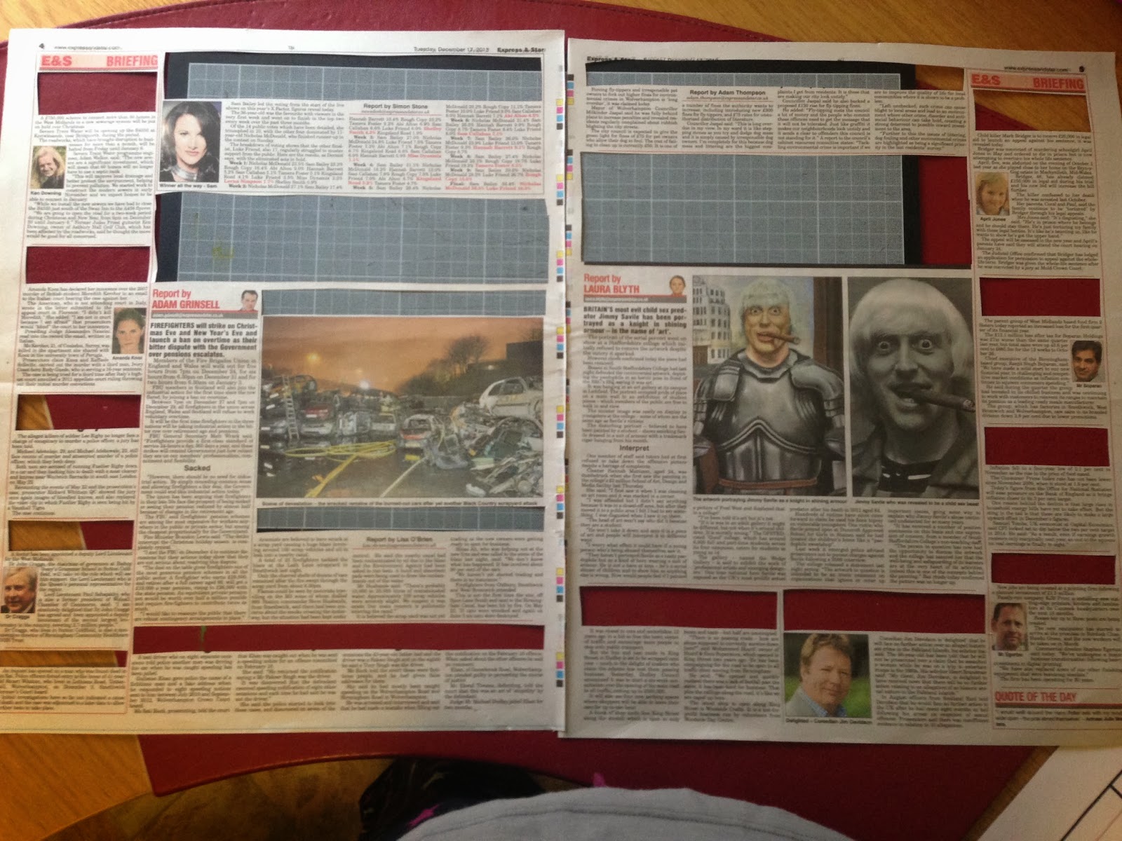

Here is the order in which the headlines caught my attention, block fonts have the most impact and I have noticed they have used different typefaces for different headlines, this depicts the order in which you tend to read the articles.
The Sun

The Sun is usually covered with adverts, offers, gossip and the main headlines of the day, normally appeals to the middle aged people as it is cheap and easy to read.

Here is a typical page in The Sun, with a headline that takes up three quarters of the page, a massive photo and advert and a smaller story that is just as relevant as the big one.

Your eye is automatically drawn to the biggest headline on the page as it is just overpowering. Then to the subtitle which is above which is in the font american typewriter and in red to make it just as powerful.
Above is an sketch of the page and how my eye moved around the page due to the typography and the image used.


This is the hierarchy of type on the double page spread. The main title is bold and underlined and is the one that grabs your attention first, then the subtitle which is in red, then the festive advertisement from Debenhams advertising forty percent off, then the smaller article to do with Nelson Mandela.
Racing Post

The racing post is for making bets on horses, but is also full of the relevant news to do with horse racing.

The first thing that your eye is drawn to is the adverts and not the articles. By using the most colour and the boldest fonts they take over the page. I have also noticed the actual headlines in this paper aren't written in capitals but lower case, I like this but I think it makes the title less bold.

This is a digram of how my eye moved around the page. It started it at the bottom with the adverts and went round in anti-clockwise format.

There is alot of body copy within these pages and it doesn't stand out at all, just one big blur of text.

This is the order in which I read the type within the article. There is alot of different fonts used within one page, also the use of colour has made the type stand out alot more.

This is the order of the most eye-catching type when it is on white paper. They change alot from upper case and lower case titles, I find the lower case titles easier to read when on white background but doesn't stand out enough within the article.
No comments:
Post a Comment