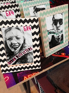
Here are my final outcomes for this photo frame brief. I have tried to make them uni sex so now the frames will appeal to both boys and girls. The reason for the scrunched up photos is that everything is so digital these days and photos/memories can be lost/ deleted in a flash. So the scrunched up photo refers to a photo being a piece of litter/rubbish discarded because people haven't been bothered to print them and put it in one of their frames.
Overall I am really happy with the outcome I think it suits the store well, I have took into consideration the colour of the type, the greens and blues are the colours of UO's original logo and the pink is for high impact to to attract the female audience. I have really enjoyed this project as I enjoy photography and photo manipulation. If I had more time on the project I think I would of done hand drawn type.


No comments:
Post a Comment