Thursday 21 May 2015

OUGD505- Product, Range and Distibution Evaluation


Beginning this project I researched into many advisements and I came especially interested in animal rights campaigns. I initially started to research into the ivory trade and how elephants are abused for their tusks to make jewelry. I researched into what was happening now and found some shocking facts about African rhino poaching and some interesting info graphics. After a lot of researching into animal rights the subject I came across most interesting is fur. I came across some really disturbing videos and facts about China’s fur farms, how the animals are treated on the farms and what happens to them during slaughter.

Peta is the one campaign that I focused on, looking at their advertisements I realized just how badly they do it mainly using blood, naked women and gore. The advertisements make you want to look away not look at them, they are far too shocking and I don’t think they work very well. On the other hand one advertising campaign that I did think that worked well was the WWF ‘Give a hand to wildlife’ using no distressing imagery they convey a simple message across their advertisements.

Once researching I then began to think about my own campaign and how I was going to convey the fur message. I began by sketching out some ideas at first I found it difficult to think of ideas. I wanted my campaign to make people more aware of what is happening to these animals, for consumers to realize that it is wrong and should never buy fur for decoration. The target audience for my campaign would be quite wide being 18-50 year olds but mainly people interested in fashion. I want to open the audience’s mind to what is going on in these fur farms.

After much thought I decided I wanted to do something quite practical for this brief and try out areas I haven’t explored before such as fabric screen-printing and spot 
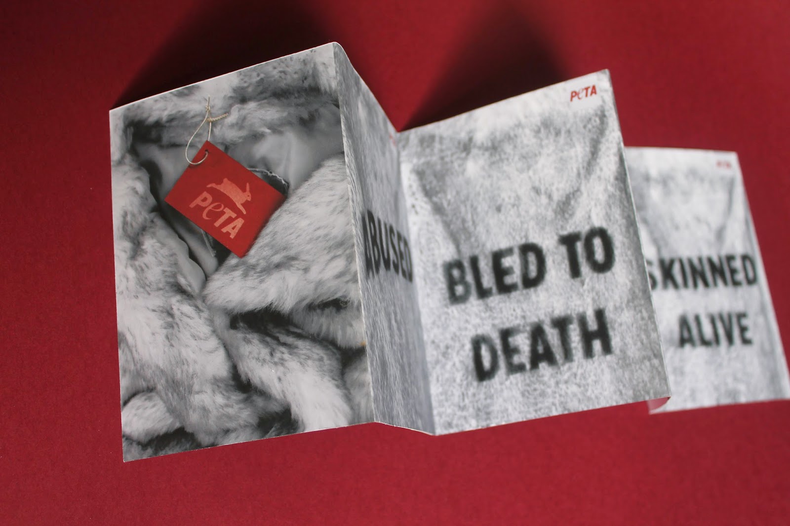
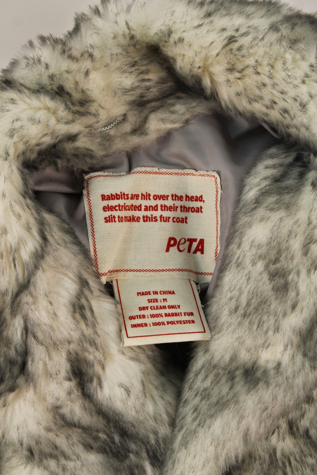
varnishing. I began to design a label for the inside of a fur coat ready to screen print on fabric to be one of my posters. I also designed labels to spot varnish for a high-end look. Screen printing took up a lot more time than I expected as things just kept going wrong with my screen, I should of allowed more time for screen printing. Once I had screen-printed I was then ready to do the photo shoot for my designs for my postcards, zine and poster. I had a lot hanging on this photo shoot, as the final images would be my overall designs.

I explored quite a few ideas within the photo shoot, including hanging the fur coat, fur on type and the label. I really enjoyed doing the photo shoot and got some good results to reflect my campaign. One thing I didn’t think about though was the shadow the projector would show within my images, if I had more time in the studio I would of experimented further with this. Once the photos were taken I chose some to go into Photoshop and experimented with colour and layout.


The photos went though out my designs and are the basis of my Peta campaign. I used a limited colour palate thought the campaign to make sure it all fit together and so all of my outcomes could be cheaply printed and distributed widely. Overall I am happy with the outcomes of this brief if I had more time I think I would of liked to have spent it screen printing or experimenting with another new technique.

OUGD505- Fur- Poster in context


Here are some mock up’s of my poster in context. I have decided to go for just one poster and not a set as I feel this one communicates the message best and is the one that the most time has one in terms of screen printing the label, stitching and photographing. I decided to have the fur in black and white and the label in colour to allow the label to stand out more as the red is suppose to portray blood. Peta normally go for over the top blood, gore and nakedness when advertising that normally looks quite flat. Peta’s advertisements are shocking and normally make you want to look away. But here I have created an advert that is calm, conveys the message and I have tried to make it quite textured through the use of fur. 


Wednesday 20 May 2015

OUGD505- Fur- Post cards


This postcard constatina publication would be placed in high street stores to educate consumers about fur and what is happening today. Consumers may take the whole thing as a leaflet and they can be split up into factual postcards. On the front is an image of my spot varnished tag and throughout the postcards type on fur, with facts in burgundy on the reverse. I have created this as I would like to make people think and take action and donate to a good cause and help stop animal cruelty in-particular legal fur farms. 

OUGD505- Fur- Zine


The purpose of the zine is to educate people on what is going today with fur farming. The zine would be placed in high steet stores and well known brands as a pick me up zine. The zine includes a couple of fashion related images to keep in with the theme, facts about fur, what animals are beaten and killed for their fur, an article about China’s fur farm, peta in action what peta does, and fur graffiti in Dublin. I have printed the zine on a thin stock as I am thinking about distribution, but to keep the zine looking high end and suitable for all stores I have added in the Peta logo as a tab on the front so consumers instantly know what the zine is going to be about, peta and fur. I tried to keep the design simple and consumer friendly, something that women would pick up and put in their handbag and read on the go. 


OUGD505- Tags


The idea behind these clothing tags is that they would be placed in places with real fur and tied onto the fur garments as a warning of what the garment is made of. Abit like how cigarettes warn you of the dangers of smoking as you buy them. The tags have been screen printed and spot varnished to give them a high end look and so they would fit in with any high end brand. The black ones would be more discreet than the burgundy but the burgundy fits in well with the rest of the campaign. Overall I am happy with these and happy that I have tried out spot varnishing as a new technique even though it was time consuming I would defiantly like to do more of it in the future. 


OUGD505- Inside Label- Final poster


This is the final poster idea that I am going to go with. This is the idea I have spent the most amount of time working on through screen printing onto fabric, stitching and photographing. I photographed it with the intention for the type to be wavy but still easy to read. I have chose a type for this idea from my research into cigarette packaging and the warnings within those. I think this photograph on it’s own portrays the message I want to get across. Again I wasn’t too keen on the colours in the original image and when printed the colours seemed alot more yellow than on screen. I decided to use a colour splash technique on Photoshop, where the whole image is black and white apart from the bit selected. I think this technique works well with this image as it makes the red pop out more and have the connotations of blood. 

Tuesday 19 May 2015

OUGD505- Fur- Development

Fur Experiments

My first idea and experiment I had on Photoshop was to turn the full bleed fur images into black and white and experiment with contrast and making some tones deeper. I think this has worked well as I’m not too keen on the colour of the original fur coat. I think the effect has worked well and almost looks as if the type has been stamped onto  the fur. If these were adverts I don’t think they would need any more explanation as the message is simple and clear enough already.


Fur coat experiments

An idea that I wanted to try physically turned out better than I thought. I realised before projecting the words that there was going to be a white box where the projection is but there was no way of getting rid of this. One thing that I didn’t like about these images was the shadow on them, I have tried various things on Photoshop to tone them down and get rid of them. I like this idea and experimented with tones on Photoshop, I think these photographs would work well in a fashion magazine as I think it portrays the message effectively. 


Colour Experiements

Here are some colour experiments I have had with the fur. I don’t like the original colour of the fur I think it looks quite bland and I wanted the type to pop out more so I experimented on Photoshop with hue and contrast and placing different colours over the top and experimenting with opacity. I think the red/ burgundy works well and would fit in well with my brand guidelines, however I do like the blue and brown tones in the other fur and the texture it portrays. I think the type stands out more and looks almost burnt.  


Monday 18 May 2015

OUGD505- Fur- Photoshoot


I had a lot hanging on this photoshoot to what my final designs are going to look like. I had quite a lot to photograph including:
• the fur coat with projected type
• close ups of the fur coat with projected type
• fur textures
• the inside sewn in label in the fur coat
• spot varnished fashion tags

Some area’s of the photoshoot went better than others. It took a while to get the fur coat hanging from the ceiling using fishing line and bulldog clips. The positioning of the fur coats back was important as I didn’t want many creases in it as type would be projected onto the back and it might make the type too difficult to read. When photographing the fur coat there was a massive shadow behind the coat that couldn’t be helped much as it was from the projector. I plan to play around with this shadow on Photoshop. The close ups of the type on the fur worked well as you could see the texture of the fur coming through the type. I took many photos of this experimenting with short snappy words. I was originally planning of having a fact on the back of the fur jacket, but the amount of type was too much and made it illegible. 
Other photo’s that needed to be produced was ones of the inside screen printed tag. For my poster idea I just wanted the tag to be nice and clear and the focus on the photo to be on the tag but also showing some fur of the coat.


Thursday 14 May 2015

OUGD505- Fur- Screen print

White on black


Screen printing took a lot longer than I was expecting after having various issues with my screen and coating. The first thing I screen printed for my Peta campaign was the inside of the clothing tags. I want the clothing tags to have a high end feel to them as most real fur coats are for high end fashion brands. As I wanted that high end look I decided I wanted to screen print the tags on black so they would fit with any high end fashion brand. I screen printed four different tags with different facts about fur. The type was quite small so the screen printing came out a lot better than I was expecting. 

Fabric screen printing


Fabric screen printing was something I have done for the first time. I used fabric binder and a red pigment mixed with some brown pigment to give it a darkened burgundy tone. These have been screen printed as they will be sewn inside of the fur coat ready to be photographed for a poster design. Screen printed onto fabric brought out a really nice effect and looked better than I expected, fabric screen printing is something I would like to explore more of in future briefs. 

Spot Varnishing


I decided to spot varnish for the tags as-well to give a high end look again. This is the first time I have ever spot varnished and I have learnt a lot. I have realised just how quickly the varnish dries on the screen and blocks up your screen, allowing you only to get a few prints out at a time before you have to re wash your screen and start again. Spot varnishing was very time consuming but I am happy with the results. I think it makes peta look more high end and is a universal design to go in any shop and on any piece of real fur clothing. 


Saturday 9 May 2015

OUGD505- Covered- Screen print


Here are a few images of the outcome of screen printing, I had a few issues with my screen as the black kept getting dried out and blocked in my screen that’s why on some of the prints the TV’s are patchy. 

I am happy I decided to screen print the book cover for exhibition, the silver has worked well on the paper. I will be using a pink one for the exhibition.  

OUGD505- Covered- Colours


Here is my final book cover design. One issue I did have is getting the colour to be a good shade of pink to match the paper from GF smith to moc the book cover up. After a few attempts I got the colour I wanted. Overall I am happy with the book sleeve and the design, one thing I have thought about is whether I think the pink makes it look too girly however I think everyone can like pink as a colour, I think the pink will make it stand out on a shelf. 

Friday 8 May 2015

OUGD505- Brief 2 Covered- Colour Variations


I am going to use my GF smith paper for this brief so I have been experimenting with colour variations that could work with the bright paper. 


I have decided to go with black and a metallic silver for inside of the TV's, I think the black will stand out best on all of the paper and the silver will represent the inside of the TV well.