

site map
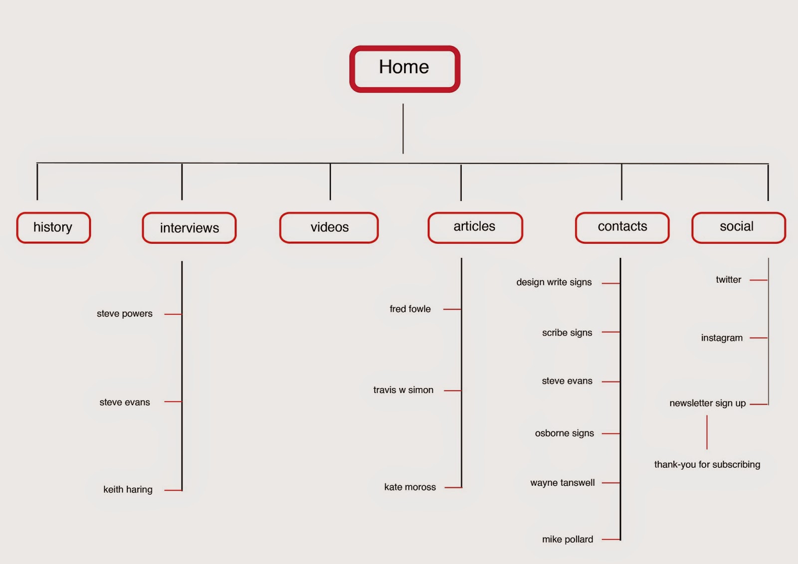
After the crit I decided to re define the pages of my website and the layout as I want it to have more structure but still be a single page website. There are going to be links to several articles, interviews and videos so I need to define the structure for those also.


Above is going to be the main structure of my website, this will be the single page with links.

As you hover over the contacts on the contact page I want the colour to change to orange and the information for how to contact them to appear. Above I realised that there isn't a colour to have the text that would make it easily readable.

I decided to have the information in a white box to make it easily readable.


for the user to read an article I would like my website to function as when you hover over the image the image will turn blue and the curser will indicate that it is clickable, the image will be the link to that article

Once they have clicked on the blue image they will be directed to the interview, at the top of the page of the article there will still be the header so the user can navigate back to the original page.
Above was the original layout for the article page, however I have realised that the columns of texts wont work well as a website, single blocks of text would work better as the user can scroll down the website.
Steve Powers


This is the amended page, I think the bright imagery complements the colour of the buttons really well
Steve Evans


This is the second interview for Steve Evans a sign writer from Walsall I interviewed myself
Keith Haring


This would be that page that it would link it to for the Keith Haring interview, it is very text heavy but I think it needs to be as it is an interview.
Fred Fowle


This would be one of the article pages this one would be for Fred Fowle, I want to keep the webpage consistent as there would be new articles each week if this went live
Travis W Simon

This would be the page that would be linked to the travis w simon article
Kate Moross

this is the page for the Kate Moross article/interview, they all have a simple grid behind them as new articles would be updated weekly and it is a simple grid for all the imagery and text to fit into


This would be the page after you have submitted your e-mail to get updates on new articles ect. I have kept it simple, a thank-you with the main header bar still at the top for the user to direct back to the home page
No comments:
Post a Comment