

I have decided to enter a submission for the Leeds College of art Nest magazine to design an advert for the Sela Bar, a music and pizza bar in Leeds.
http://www.selabar.com
Below I have looked at a few of their existing designs that they have on their twitter and Facebook.
They are all bright, have use of bold type and quite illustrative.
For the poster I would like to include the fact that it is a pizza bar, live music, and cocktails as I think these are the three things they aim for.
The advert should represent the creative business as a whole and not be for a particular event/product. Incorporate whatever text you feel appropriate in the design, if any at all - although the name of the business and contact details [social media, web, contact number and address] have to be included.
The advert has to be B5 format and portrait.


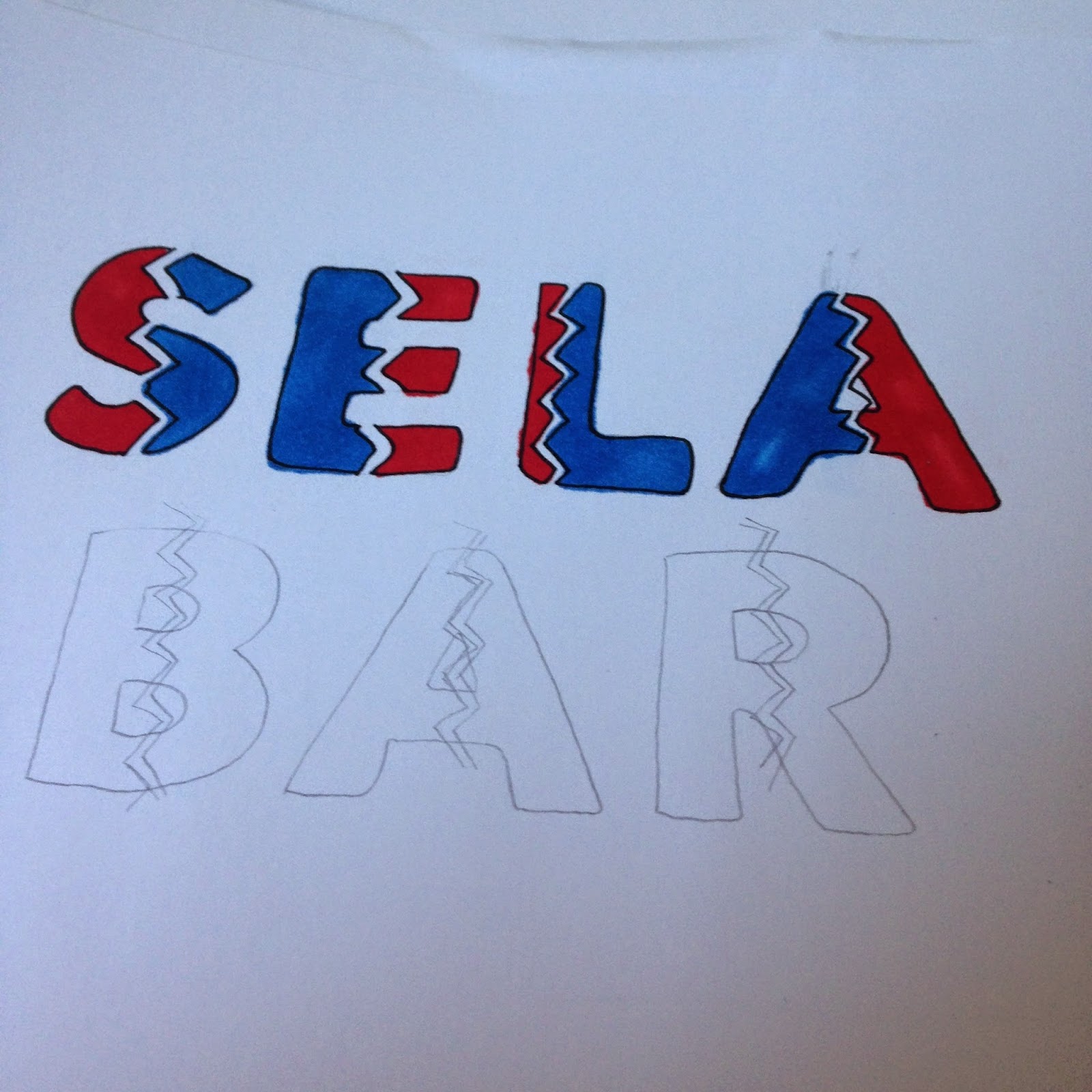


I started to experiment with some hand drawn type and the different ways to make the letters more decretive.

Above is a scan I did of a quick sketch of some type, instead of making the type decretive I decided to make the background decretive and have the letters as negative space, I tried scanning it in before I did the whole thing as it was quite time consuming, once scanned it I didn't like it as much as when it was on paper.


Above are some more type experiments, trying to make the letters feel like the words.

Above is my final design, I will then scan this in and edit it in illustrator


I decided to use red blue and white as they are bold colours and I looked at a few of sela bars previous designs and they do include a lot of red and blue so I wanted to keep with their theme.


Above is my final design that I am going to enter into the competition, I decided to go for hand drawn type to keep it fun, I am happy with the way it has turned out, I have learnt quite a bit on illustrator from making this advert from making mistakes.
Evaluation
I decided to respond to this brief to design an advert for Sela Bar to potentially be featured in the next NEST magazine, Leeds College of Arts student magazine featuring students work that will get distributed around Leeds. I decided to do this as I enjoy making posters and adverts and I wanted to create something unique.
To start this brief I started to research Sela bar and their online presents, I have previously heard of Sela bar but never actually visited. While researching I really liked there previous designs, I like the retro look and colours used.
I noticed while researching that they use bold type in a lot of the designs, I decided to use hand drawn type on this advert as I enjoy doing it and it is something I want to get better at and develop. I experimented by hand a lot for this advert and then started to scan my designs in to see which ones work best and how I could develop them. I only used illustrator when creating my advert, it is a program that I am not very confident on, but through making mistakes I have learnt a lot. I decided to use a small colour palette as I noticed in my research that the existing adverts that they have only tend to use two of three colours, I went for blue, red and white as they are bold colours.
Overall I am happy with my design, I sent the design of to the editor of Nest magazine and the design will then get sent off to Sela bar and they will choose the best one they would like to represent their business. If I was to do this brief again I think I would of liked to start it earlier as I didn’t realise when the deadline was. I think I would of made something with digital type and experimented with some retro advert ideas.
No comments:
Post a Comment